


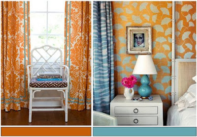
Everything about Kate Spade is bright, bold, and beautiful ...
Need I say more?


 Jill Brinson’s house: my latest obsession.
Ever since House Beautiful’s December issue came out, I’ve been slightly obsessed with the cover story’s house – to say the least. It’s been a long time since one house has really excited me as much as this one and for me, that’s saying something. Since starting this blog, I’ve been exposed to a barrage of design – and to tell you the truth, not a lot in the magazines has thrilled me lately. I’ve thought about this and wondered – is it just me? It used to be that I would get a magazine and sit down with it and read most of its stories. I’d spend a few hours, maybe even days, thoroughly digesting an issue before carefully storing it away. But lately it seems I go through the magazines so much quicker – I rarely find an issue that takes me more than a day to absorb. Some magazines, I just flip through and toss on the spot. Others never even make it off the rack and into my house. These days, if a house in a magazine doesn’t grab me right away, I don’t waste time on it – after all, I can always go to the internet and jump from blog to blog to blog and spend hours reading all about someone’s charming cottage in a tiny town in Sweden that will never be published, or follow the ups and downs of a house being built in Australia, or even become engrossed in the saga of a bathroom redo somewhere in Alabama. With each quality magazine that is now gone – wonderful ones like Southern Accents and Country Home and Cottage Living – the pressure seems to build on those left. It’s as if I expect The Big Three to come up to the plate and really deliver a knockout punch each month. Am I expecting too much? Am I jaded?
 Close up of Brinson’s living room.
But then a magazine like House Beautiful’s December arrives and it just kills me. Two months later and the issue is still on my dashboard. If there was ever a better magazine issue – I haven’t seen it. I can barely even make it past the cover story. Every time I try to move forward, I go back to that house in Atlanta with its flowerless green garden. The pictures! Those huge, gorgeous pictures! Why every magazine hasn’t followed Editor Stephen Drucker’s lead is beyond me. He takes us to the front door and out the back – and everywhere else in between. But, he had a lot to work with. The house is fabulous, Belgium meets France on the way to Sweden via the downtown commercial district. Sigh. There’s no point in fantasizing about it really. It’s so unique there’s not another like it to be found anywhere. It’s not like you could casually say to your partner one Sunday – let’s find a house like THIS and move. There IS no house like THIS. I suppose you could find a old cottage somewhere and rip out a bunch of decrepit windows and replace them with huge steel ones. But then, what about those ceilings – those tall, beamed ceilings – how would you replicate the loft?! And if such a house did actually exist, would it have as wonderful a kitchen – one that even I would spend my days cooking up meals in there that would make Mr. Slippers Socks Man a contented one, for once. Perhaps the dining room could be copied – a carpenter could build identical cabinets with the arched doors and chicken wire. But you would still need the windows, the beams, the lanterns, the white dishes – and the cowhide on the table and the wicker chairs. It’s nice. The owner, the designer, the stylist – Jill Brinson – she’s something.

Brinson is the Creative Director of Ballard Designs and she does interior design, she just designs – anything, everything. A stylist extraordinaire. There is nothing in her house that just “happens” to be there. It’s all planned and thought out – though probably not even consciously. Styling for her is like breathing. Oh, to be that talented! What a gift from God!

The house was totally gutted and remodeled by the Brinsons. The kitchen became the dining room, the dining room became the kitchen so that it would lead directly to the flowerless green garden. In the bathroom above, Jill wanted her tub to look like a trough with the faucet coming directly from the wall. I love how the backsplash is made of wood, yet shaped like a marble slab.

The green garden. It if flowers – it better flower green.
This house has invaded my brain. I wanted to take an hour on The Skirted Roundtable to talk about it – picture by picture, but I’m afraid Linda and Megan weren’t quite as “touched” by the fever as I was. But still, when Editor in Chief Stephen Drucker sat down at the table, it was all I could do to talk about anything BUT the house! I’m not crazy, I promise you. But haven’t you ever fallen madly and crazily in love? Did anyone else feel this way about this house – am I the only one?

The House Beautiful cover with mi amour on the cover. Is anyone else out there as obsessed with the Brinson’s house as I am? Was there anyone else who kept this issue in their car for two months – just in case they needed inspiration at a red light? So, imagine my surprise and utter delight when I saw a blog with a magazine cover that looked like Jill’s living room.
 Valorie aka The Visual Vamp’s living room.
Valorie of the blog Visual Vamp – is obviously as love sick as I am. She spent a few days of her precious time trying to recreate the Brinson cover photo in her own home. There was something in the cover that reminded Vamp of her own house – an original Shotgun off Magazine Street in New Orleans. I can see why Vamp saw the similarities: her white sofa is reminiscent of Jill’s. Vamp owned two brown cowhides, just like Jill. With a little tweaking and a lot of styling – Vamp decided to go for it – she would style her living room to look like the cover story. Could she? Above is the Vamp’s living room before Jill Brinson. She flittered around and gathered her styling tools – and ended up with her version of the House Beautiful cover:
![[HB+Fake+2.jpg]](http://2.bp.blogspot.com/_sfw0cPTAuWs/S1cscMJEVII/AAAAAAAAPsY/Av4Jy-9AXzA/s1600/HB%2BFake%2B2.jpg)
Viola! Here is Vamp’s living room restyled ala Jill Brinson. Pretty good I think! She put her brown cowhide on the white leather sofa, just like Jill did. Vamp added two paisley pillows, just like Jill did. Vamp changed out her coffee table for a tea table. While Jill has a black metal table, the scale of the two tables is the same. Vamp added the hot pink throw and the pink flowers, just like Jill. Then she took a picture of her newly restyled living room, photoshopped it onto a fake House Beautiful magazine cover and there is it. Visual Vamp does Jill Brinson. When I saw this, I almost had a heart attack, I was so excited and jealous at the same time. Me too, me too, I cried! After all, my sofa is very similar to Jill’s (that’s about the only thing though.) I rushed off an email to Vamp: “ok, I’m throwing down the gauntlet (really, what does that mean?) – I’m going to restyle my family room like you did. Do you mind?” Of course in blogland, it helps to have manners and ask such things like, do you mind if blatantly copy your idea? Vamp didn’t care if I copied her idea, in fact she rushed an email back to me in two seconds with these words in the subject line” DO IT!!!!!! Who am I to refuse?

Seriously though – how was I going to get this room to look like this:
The shape of our sofas are very similar, and the height of our coffee tables are the same. That’s it!! After assessing the situation – I was ready to call it a day and hand the gauntlet back to Vamp and let her keep the damn gauntlet. But, it ate at me. Thinking about how much fun Vamp had had – how great she had made her living room look, how cute the fake magazine cover was, I got motivated again. Alright, I need the pillows. Jill’s fabulous pillows came from “Two Girls In Avignon” (how cute is that name?!) But, how far did I really want to take this game? Would I seriously order two pillows for a fun photoshoot? And I didn’t own a brown cowhide rug like Jill and Vamp did. Should I really go buy one at Ikea just for a picture? They cost a $100. Ridiculous. But, I did have brown velvet pillows that had recently replaced the zebra Oly ones:

Then I had a brainstorm. The antique store Neal and Co. carries Les Indiennes fabric, maybe I could go there and borrow some fabric and wrap it around a pillow! All of a sudden I had a plan. Go beg some fabric from Cindy Neal. The brown velvet pillows can then take the place of the brown cowhide.

Neal and Co. – What a bench, filled with Les Indiennes fabric pillows.
At Neal and Co. I was excited to learn that not only did they carry Les Indiennes fabric, but they had made up pillows in several different fabrics. While it’s not a paisley per se – it does have the “look” of one – so Cindy let me take a few out on approval. Yes! Late last night while all my family was sound asleep, I was styling the family room like some crazed maniac. At one point Ben came down for water and found the room a complete mess and asked simply - “what are you doing?” “Nothing.” I wonder what he would have thought had I told him I was trying to copy the cover of House Beautiful! Perfectly normal, I know!!! Especially at 3:00 in the morning. Well, I’m sure the Vamp understands. For the pink throw – I had gotten a shawl in that shade as a Christmas gift and thought it was a genius idea. Except it photographed a dull coral, not pink. And for flowers – I thought I’d just use my pink orchid. But it didn’t photograph good either. I dragged my suzani on the sofa along with the Les Indiennes pillows, using the brown velvet ones in place of the brown cowhide. It didn’t really look that great – certainly didn’t look much like Jill’s at all and I was prepared to pronounce Vamp the winner in the Plagiarize Jill Brinson contest – with just us two contestants. Oh well. That was fun, but a major disappointment. See what I mean:

No – it really didn’t look all that great. I know Jill didn’t have a zebra rug either, but I didn’t have the energy to move it. You can hardly even see the pillows with the orchid overtaking the photo. The suzani looked alright –but it just didn’t look like the cover picture. And taking pictures at night does not capture the room at its prettiest. Oh well, tomorrow is another day! And, tomorrow I found I just couldn’t let it alone. I was first in line at Joanne’s this sunny Sunday morning buying a few yards of hot pink acrylic suede. And while I’m at it, I’ll buy some pink roses to match. And some green apples. If I am going to do this, I am going to at least try to do it right. Here’s what I came up with today:
One more time – here’s the original cover picture of Jill Brinson’s living room.

And my finished cover – completely different I know, but I’m kind of liking it!
Here is what it my room really looks like now:

In Jill’s room, the throw is more lavender than pink, but I thought pink would look better in my house. And the more I thought about it, the less I really cared if it really looked like Jill’s or not. In truth, I was starting to like the Les Indiennes pillows. I had never gotten used to the plain brown velvet pillows – and I think these add a nice pop. And by a strange stroke of fortuitous luck, I had Hien Lam make me an extra set of pillows in hot pink linen, which I think I can add a few into this mix if I want to get rid of the pink throw.

Here’s a closeup of the newly styled coffee table. Usually this table is jumble of Ben’s magazines and books and coin catalogues. It’s never nice and neat and styled. Today, I got him a basket to keep under the coffee table – for all his “very important reading materials” and hopefully I can keep the tabletop looking halfway decent from now on. I love the way the green apples look in the ironstone bowl. And the alabaster grapes are a favorite. My lacquer sewing box was the first “expensive” antique I bought years and years ago with money I had saved up for the HADA antiques show. For it’s entire life it’s been in the same place in the entry hall, but now I think it deserves a new home. The plates are French transferware.

A different angle – I think I’ll look for a “real” throw in this color. This one is just a piece of fabric from Joanne’s. Or, I might bring in one of my pink linen pillows instead. I am so excited by the changes, all very subtle – just a few pillows truly, but I think it makes a huge difference. It was all an exercise – a fun project to have a little competition with Vamp - but out of that, I’ve gotten a new, fresh look. And along the way, I think I may now finally be able to put my obsession with Jill Brinson away for awhile. I know that every time I see my new pillows, I’ll think of her wonderful, unique house in Atlanta – and instead of being jealous of it, I will see it as inspiration for future projects. And what did Mr. Slippers Socks Man say about the changes?

When he first came down later this morning, after I was through taking the pictures – he asked “can I sit down now?” and then “are you putting it all back, this looks so stupid.” How nice! After I explained that no, I wasn’t putting it back the way it was, I showed him his new basket for all his junk, I mean, coin catalogues. He buys gold coins just like Glenn Beck. And then he plopped down, despite it looking so stupid, and made himself at home. Him and those slippers socks. Oy. And extra points if you can find Georgie – in her camo colored coat.
In the end – I had so much fun styling my room to look like Jill’s. It didn’t come out looking like hers at all but I actually learned a lot by doing this. Taking a few key elements from another room that you truly love might be all you need to spruce up your own room. And the few changes you make, might make you love your own room, all over again!
If anyone out there is a huge fan of Jill Brinson and wants to join Vamp and me in this styling contest – please do!!!!! We would love to see your results! To get your own magazine cover, go HERE. To visit to Jill Sharp Brinson’s web site – go HERE. To read Visual Vamp’s story of her restyling, go HERE.
AND IN OTHER NEWS:

Don’t forget to vote in the Bloomingdales Big Window Challenge!!!! Please think about voting for Eddie Ross and Elle Decor’s window. This is how Eddie’s window looks from the street. It’s an amazing room, anchored by fabulous blue and white splatter wallpaper set inside blue molding. There are two other contestants, but we’re pulling for Eddie here. To see all three rooms – go HERE.

I love how Eddie filled the shelves with blue and white porcelains! It’s so beautiful! Eddie is such a great talent and his window is the best of all three, in my opinion.

I could have used that pink throw today in my room! I love the toile, ikat and leopard all mixed together.

Be sure to vote TWICE a day for Eddie Ross – through this Thursday. For more information on how to vote, go HERE. Eddie needs us all!!!

AND, one more reminder, Grant Gibson is at The Skirted Roundtable this week. To listen to this hot designer talk about design, go HERE!


