Friday, September 28, 2007

Farrow and Ball and Emma Jane


There is a rash of new design books coming out this fall in time for the Christmas shopping season. My pre-released order with Amazon is obscene: I owe them a king's ransom for all these soon to be released books. But that's ok, this is my only hobby, so I indulge it. These new books are just starting to trickle in. Alex Vervoordt's came the other day and it's a winner, totally gorgeous. Another one that's arrived is the new Farrow and Ball: The Art of Color. For those who aren't familiar with Farrow and Ball: F & B is an English company specializing in paints. Not paints as in Sherwin Williams, but paints like those made centuries ago. With names like Cooking Apple Green and Book Room Red, part of the appeal is in the romance of times gone by. Their palette is extremely limited, only 132 colors as opposed to the thousands of colors made by other paint companies. Their paint is made the old fashioned way without "modern" cost cutting measures taken. Besides paint, they also manufacturer wallpaper of the highest quality. Their designs are traditional stripes and damasks, but recently they came out with a few hipper colorways.

A company that produces such high quality goods deserves to be written about and now, they have been, twice. I wasn't taken with the first F & B book, Paint, but the new one The Art of Color is a completely different story. The photography is luscious at times and moody at others, the lens' subjects are breathtaking. One chapter that really stands out is Emma Jane Pilkington's apartment. I'm not sure if it's ever been published before, I googled for awhile and couldn't find any hint of it anywhere. So, forgive me if you've seen her apartment before.

Emma Jane, an Australian by birth, but raised in Greenwich, is a young, hot decorator who has received volumes of national press. Her apartment for Ivanka Trump is a work of art, done in bright shades of blues and reds. In fact, most of Emma Jane's published work is bright and happy. Her apartment, though, is anything but. Mainly painted in three shades of Farrow and Ball paints, the apartment is neutral in color. With a combination of modern art pieces and antique furniture, it shows Pilkington's sophisticated knowledge of classical design and refined taste for art instead of the more trendy look we've come to expect of her. Take a look at these pictures to see a side of Emma Jane that might suprise you.


Pilkington's apartment for Ivanka Trump, young and dynamic, exactly like it's owner. The colors are bright, the prints are bold.


Another design by Pilkington, here she uses Raoul Textiles in bright pinks and yellows.


And now, for something completely different, Pilkington's apartment. Modern sculpture by Mauro Corda plays against antiques such as the gold mirror. An obvious book lover, she displays them on a center table, an antique from a Rajastani palace.


Here, she mixes antique furniture, a pair of crystal chandeliers, and a stunning modern art piece just reflected in the antique mirror.


A close up of the sculpture by Verner Panton.


A contemporary sculpture by C. Jere sits atop an antique settee. Nearby is a spoon back Regency chair.


A corner of the living room with an antique zograscope and Buccellati silver atop an antique Tric Trac table, from 1760.


The study, with an antique directoire daybed juxtaposed with a leopard print contempory chair.


Close up of the daybed and another gorgeous antique mirror.


The classic kitchen with a wall of antique mushroom prints.


This bathroom is so atmospheric with the moody candlelight and marble tub. The hanging basket under the antique prints with just a touch of color from the purple flowers.


A close up of a Venetian mirror from the 1840's.


The master bedroom, with a gorgeous wall of mirrored closet doors.


Another view of the bedroom and it's unusual antique lighting fixture.

If you enjoyed these pictures, I would suggest you pick up Farrow and Ball: The Art of Color. These are just a small sample of the wonderful images from the book.

Wednesday, September 26, 2007

Calabria and Travelling Back in Time

My MIL's cousin's wife wrote the second part of her story (see part I). It is about how she felt in love with Calabria. And I realised that we are both fascinated about something in Calabria that has to do with travelling back in time and with learning how to enjoy the simple life. Please read her travel experience:

In 1997 me, my son and L. (my MIL) took the sleeper from Mestre to Pizzo. Don't think of it in terms of "Orient Express" cause we are really miles and miles away from that. In Italy, modern and updated things stop in Rome, than, everything becomes Far West or Bronx as you said...

But, we arrived safe and N. (MIL's friend) was waiting for us at the station. That was the first time I met her and suddenly for me it was like paying a visit to a nice aunt. She gave us a delicious tomato sauce for our first pasta at home.


I have not been back in Calabria since '92 and was prepared to find things unchanged. But, little by little things in the house were improving due to many small renovations L. did during our stay. Lack of water was sometimes a problem but I sensed it in a bohemian way. Thanks to L. again I was figuring out better my approach to Southern way of living which is totally different for a person coming from the ultra operative North. From that year on I met and knew lots of friendly people always available to help and share with you what they have. Every year I can't miss the 'pantagruelian' (enormous) dinners of N. - each summer she cooks for around 10-15 persons in the typical southern way - I mean frying, baking, stuffing.... It's very difficult to stay in shape until the end of the vacations.

Through the years I've had the time to realize how wonderful the sea was, crystal waters and nice beaches that have nothing to envy to the Caribbeans.


Besides, I like how the natives are so bound to popular traditions, how they decorate and adorn the streets, the churches and the pure simple fun they have during the days dedicated to celebrate the Saint of the village.


It seems as they're still living in the 50ies. In the North we've almost totally lost this kind of genuine attitude.

You see now how positive I've become and I would go on telling you how many beautiful aspects I find in every situation.


I really like her narration. I experience the same every summer. And after I realised that I especially enjoy our stays in Calabria due to that feeling of travelling back in time, I know better than before how to decorate our palazzo. I definitely do not want to see too much (or any at all) modern furniture in our house. I really enjoy the simple decoration of my family's vacation apartment. It is still decorated like back in the 60ies, 70ies when my husband was born. This orange lamp in the kitchen, the chairs, the tiles ... It is like coming home after travelling the world. And I want to have a similar feeling in the palazzo.


Check the writing and pictures of sognatrice at bleeding espresso... She moved from the US to the little village of her ancestors in Calabria. A real travel back in time.

Photos 1 - 7:
Fiat 500 in Pizzo; one of N.'s famous pasta dishes, near Capo Vaticano via flickr; Pizzo Marina; fiesta della Madonna del Carmine; fishermen at La Seggiola; il trenino a Vibo Marina - the little train that my husband took as a little boy more than 30 years ago - and it still travels from 7pm until midnight all summer long.

Sunday, September 23, 2007

Calabria in the 90ies


I got a very interesting email from one of my favorite Italian family members in Venice, my mother-in-law's cousin's wife.

In her mail she told me her first impressions about her first holiday in Calabria back in the early 90ies. Read what she wrote:

(...) I'm so fond of all Calabria that coming there on vacation for me now it's like coming back home. I feel so comfortable and enjoy all the aspects of the surroundings. But, it hasn't been so since the very beginning. Let me tell you my first terrible impressions of the first time I arrived there.

It happened in 1992, after a never ending journey by car. The house had been closed for many years and we arrived in July. It was hot of course and no air conditioning nor ventilation in it. Many times I slept in the beach-chair on the terrace. Along with the bad impression I had of the constructions which always seems so uncompleted and ruined, most of the time we hadn't water for showers or cooking. We had to spend part of the day stocking bottles and bottles of water for the main necessities.

I was desperate and wanted to go home. Much probably I wasn't in the mood to accept those things cause we mostly spent our holidays in the mountains in Suedtirol where everything is so accurate, clean, tidy, you know what I mean.
Anyway I couldn't help it and we finished our vacation.
Next time I'll tell you how I changed my mind.


The 'house' she is talking about is the appartment of my in-laws in Vibo Marina, 4km from Pizzo. Here, my husband spent the first 6 years of his live. When his parents, originally from Northern Italy moved on, they kept this home as the family's holiday residence.

I really appreciate this story as it is so true. I had the same experience back in 1996! I spent the first summer in Calabria with my husband (boyfriend at that time). It was an adventure for both of us! He hasn't been back there for years.

Of course meanwhile many things have improved, we got aircondition and water is secured. Even the construction ruine of 30 years in front of the house is finished and painted since last year.

I am curious to read the prosecution about how she felt in love with Calabria. Thank you for sharing!

picture 1: taken 2006 at restaurant Go, view of Vibo Marina, picture 2: taken 2005 at my family's house, view of Vibo Marina's port

Thursday, September 20, 2007

Paris in Houston, Part Deux


My favorite landscaping company in Houston, pictured above, is Thompson + Hanson. Yes, you read that correctly, I said landscaping! The best part about shopping for plants at T+H is their antiques. OK, that sounds strange, I know, but believe me, their antiques are more gorgeous than their plants. Culled from trips overseas to France, their assortment of goods includes: armoires, chandeliers, settees, chairs, mirrors, bath goods, candles, and books, among other things. New or old, there is something here for every part of your home and body. The building, an old, restored stone-clad structure - is a delight in itself. If I were to start over and build a house today, I would base it on this design. It is a gorgeous space, the ceiling is raised to the rafters, the windows are all steel french doors that open onto an outdoor pergola-covered patio. The floor is stripped to its bare concrete foundation - cool on a typical hot Houston day. I want to live here, I say every time I come.

Outside, the walkways are paved in small crushed stone, just as is done in France - the basis of their design sensibility. Because the landscaping is French in feel, you won't find a lot of bright, blooming plants here. The focus is more on grasses and succulents than on azaleas and crepe myrtles, the typical mainstays of Houston landscaping. Large pots made of stone or tin are filled with grasses that quietly sway in the breeze. A large fountain is pouring water into what appears to be a huge animal bath, made of iron, not the usual stone. Nothing is typical here, nothing is expected. And no one does this better than Thompson + Hanson. Located on Saint Street in the hot, new upcoming design area of town. Neighbors include Indulge, Design District, Pile, Chateau Domingue, Krispin, and the soon to relocate, M. Naeve, featured yesterday.


The gorgeous interiors - hard to believe their main business is landscaping!

French antiques are everywhere - I love this daybed.

My reason for coming back time and time again: the up to date collection of Betaplus books, the only place in town you can buy them.

This gorgeous screen would look so good over a sofa.

Swedish antiques peek out amongst the French ones.

Typical elements of Thompson + Hanson design: stones, succulents, and perennials.


Their plants take on a contemporary feel, as do their landscapes.

No bright colors or new gauche pots, the simple - the better.

Modern pedestals contrast with antique urns.

Massed for effect.


The wildly inventive fountain.

Entry to the nursery is through a pergola holding up a water tower.

Evergreen wisteria climbs up the patio's pergola.

The best part: picnic table and wicker chairs set under a gorgeous antique chandelier. Takers, anyone?

Sunday, September 16, 2007

"Something's Gotta Give" at House Beautiful


This month's issue of House Beautiful is a beauty, story after story, I'm loving it. There's a spread on Suzanne Rheinstein's fabulous new fabrics. Suzanne is looking good these days, younger and younger! She's unrecognizable to me in this issue. Then there's a great story on Belgian design and another one on a fabulous apartment by Joe Nye. The Peak of Chic already showcases that story here, as does the House Beautiful web site.

There is one story in this issue that is very strange, though. As you may remember from my previous blog on the movie, Something's Gotta Give by Nancy Meyers, the Hampton house that starred in that movie actually upstaged Jack Nicholson and Diane Keaton. Scores of articles have been written about the Hampton house, and people have designed their own homes based on it. Why is it so universally loved? It could be the soothing blues and creams, the famous striped dhurri rug, the ironstone dishes in the dining room with the Bennison slipcovers, the Swedish Mora clock, the dark wood floors, the fabulous soapstone counters in the even more fabulous kitchen - I could go on and on about why that house appeals. So, I was thrilled to see an article in HB by the interior designer of the famous Hampton house. Or is he?


The living room with the striped rug, dark wood furniture, and Mora clock that stole a movie!

James Radin is profiled showing a beautiful home that he designed for a young couple with three daughters. Interviewed by Donna Paul, she starts off with this question:

"You've designed houses in two hit movies by director Nancy Meyers, Something's Gotta Give and The Holiday. Are you a set designer or an interior designer who also does sets?"

HUH?????

I've always believed that the Production Designer of Something's Gotta Give was Jon Hutman and the Set Director was Beth Rubino. James Radin's name has never been mentioned in any articles that I've read on the set design. Jon Hutman is also listed at the Production Designer for "The Holiday", another movie of Meyers' where the set steals the show.

The dining room with the Bennison slipcovered chairs and wonderful ironstone collection.

Continuing, Radin's response to the statement that he designed these fabulous homes for Meyers' movies: "I'm an Interior Designer. I designed Nancy's own house and she asked me to help the production design team with Diane Keaton's house in Something's Gotta Give. She wanted it to look professionally decorated, like Diane's character would have."

The much talked about soapstone countered kitchen from the movie set.


Paul brings up the movie several times throughout the interview and it's mentioned in the notes accompanying it's pictures. There's even a TV with, you guessed it, Something's Gotta Give playing on the screen. House Beautiful definitely wants the reader to believe that Radin was the credited designer on the two movie sets.

Another view of the living room with the leather ottoman and slipcovered sofas.


What's going on here? It seems strange. When I first read the article, I was excited thinking, wow - this is designer behind that fabulous house. But I kept thinking about Beth Rubino, the famous set designer. Wasn't she the designer here? A detailed Google search for Something's Gotta Give and James Radin showed only one hit: on the credits, Special Thanks go to James Radin. It leaves me wondering, who's scamming who here?

Another shot of the dining room, dark wood floors, seagrass rug


Below are a few pics from House Beautiful of Radin's admittedly beautiful home, regardless of whether he is THE designer of the famous Hampton house or not.

For much more detailed reporting on the movie set of Something's Gotta Give see Surroundings' blog

Radin's master bedroom, serene in whites and creams with touches of blue.


The lady of the house's walk in closet. Now this is luxury.

Friday, September 14, 2007

Living With Dogs and Slipcovers


My favorite dog book, Living With Dogs, isn't really a dog book, per se. It's about design that pertains to dogs: dogs in art, dogs at home, dogs as collectibles, and so on. Written by the husband and wife team, Larry and Carol Sheehan, it presents dog owners, dog memorabilia collectors, dog breeders, and dog enthusiasts in essays about the lives they spend with their dogs at home and work and at leisure. A must for anyone who loves dogs, I'm now on my third copy. One went to my sister in law, who, like me, owns Springers, and one cover was destroyed by my puppy. We're unashamed dog lovers in our family.

Two dogs live in our house, an English Springer Spaniel named Georgie who looks exactly like the dog on the book's cover and Sammie Jo, a Cavalier King Charles Spaniel. Of course, being the design freak that I am, Georgie came to live with us first and when the time came for a new puppy, I wanted a lap dog. The only lap breed that matches the coloring of a Springer is a Cavalier, so, that's how we ended up with Sammie Jo - she's a miniature Georgie. They do look cute together, I have say. Before these two dogs became Webbs, we had a few beagles along the way - stupidest dogs on the planet - and a couple of cats too. I learned the hard way that the only way humans and animals can happily cohabit a home, is if you have slipcovered furniture.

Now, before you hold your nose and say "I despise Rachel Ashwell" and Shabby Chic-less, slipcovers don't have to be loose and wrinkled. You can have slipcovered furniture that is very tailored, and you certainly do not have to have white sofas with piles of rose covered pillows. Give me a minute or two and let me show you that slipcovers can be dressy or even contemporary. If you plan on having custom made slipcovers (the only ones I would recommend), you should wash your fabric before the covers are sewn. If you choose a fabric that doesn't wash well, you can just dry clean the covers once they get dirty. I would never again live with furniture that wasn't slipcovered, even if I didn't have animals. Once you have had the ability to toss your upholstery in the washing machine, it's hard to go back to having it steam cleaned by some clueless employee of Steamomatic.


Aw, isn't she cute? Sammie Jo, the always hungry, stone deaf, Cavalier King Charles Spaniel. Here's she licking her lips thinking the camera is a big steak.


Georgie, the shy, sensitive one - totally scared of the camera. That's Ben's big stomach in the blue shirt that Georgie is burrowing her head in trying to escape the mean camera. Georgie's too smart to fall for my tricks like Sammie Jo.


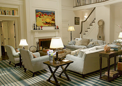
White slipcovered sofa dressed up for a living room or a family room.


Here's a khaki slipcover, again dressy enough for a living room.


Loose white linen, good for a sunroom or den, Madeline Weinrib rug.


Home of a Houston purse designer, white slipcovers contrast with dark chocolate walls.


Another Houston home, this owner is an interior designer. I love the slipcover treatment on the french bergere. The tabs allow the antique wood frame to peek through.


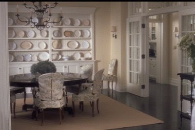
My breakfast room chairs, scalloped slips in two pieces, the top is tabbed, again, to let the antique, painted wood, chair frame show through.


Here is the "new" look of Rachel Ashwell's Shabby Chic: more modern, less cottagey.


Again, Rachel showing leaner lines in her furniture. Although the chandelier, a Ashwell trademark, is a dead giveaway that it's Shabby Chic.


Classic Shabby Chic: ruffled slipcovers, white painted furniture, silver, and lace.


Alessandra Branca from Chicago designed these slipcovers to not be obvious. These slips are purely for pet and children protection, not to have a "slipcover" look.


Windsor Smith's slipcovered sofa has a pleated detail that can go from the living room to the bedroom.


Jackie Lanham's slipcovers are made to be noticed given the large ties on the back. This is a beach house, which is a perfect place to use slipcovers.


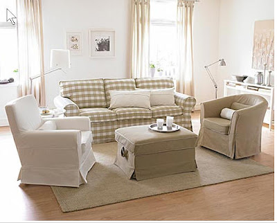
You don't have to spend a fortune on custom slipcovers if you are budget conscious. IKEA sells this line of furniture with many different fabric options. Above, the furniture is shown in khaki and white, and then the same furniture is shown with navy and white slipcovers. This line of furniture is SO inexpensive, making it perfect for a playroom or a second home. It's actually very comfortable and a great buy.


A company that sells more expensive slipcovered furniture than IKEA is Lee Industries. This sofa above is definitely a playroom or beach house candidate.


This cream slipcovered sofa, above, is also from Lee Industries. It can go in the living room or the family room. It was designed by Robert McAlpine, noted architect and interior designer. Lee carries several of his sophisticated furniture designs.


Mitchell Gold single handedly brought furniture to the masses with his designs and helped fueled the Pottery Barn and Crate and Barrel furniture revolution. Basing his furniture on classic lines that mimic George Smith designs, he kept his wholesale price points low enough so that furniture no longer had to be "paid out" on credit. This advertisement shows an arrangement which a young married couple would put in their "dressier" living room.


In Houston, no one makes better custom slipcovers than Shabby Slips. Branch stores are now located in New Orleans, Rosemary Beach, Austin and Santa Fe. This picture shows the Santa Fe showroom, with it's more western accent.


Another small furniture chain that makes slipcovered furniture is Quatrine. Above is a typical slipcovered sofa, the trim is what makes it special.


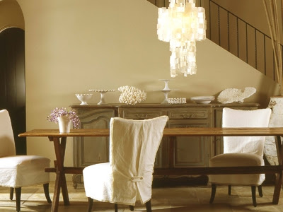
Slipcovered dining room chairs from Quatrine. Dining room chairs are another great item to use slipcovers on, whether you have animals or not. After a messy meal, toss them in the washing machine. These ruffled slips show the more feminine side of slipcovers.


Here is a Quatrine showroom, showing their more contemporary slipcovered merchandise. These slips are tight, giving no hint of their practicality.


This dog won a nationwide photo contest that Quatrine ran. No need to worry about dirty paws or dog hair on this sofa. The contest makes it obvious that they target dog owners for customers.


Above, another retail outfit, BeachDwelling, has a store in Alabama, but they also do a large internet business selling slipcovered furniture to the second home market. Here, are some of the dining room chairs, furniture, lighting and accessories that they sell.


Again, BeachDwelling, this time showing a chaise lounge. Comfy!


No country does more slipcovered furniture, I believe, than Belgium. In every castle, country home, or city townhouse, most of the "decorated" houses are loaded with slipcovered furniture. The furniture in Belgium tends to be very large, very deep, and very severe in its lines. Below, no one does it better than Axel Vervoordt. Stunningly beautiful, very dressy, and yet, he uses a white linen slipcovered sofa. This is as far from Rachel Ashwell as it gets. Gorgeous:


Grey linen is a frequently used fabric in Belgium. The typical Belgium design features oversized furniture, oversized accessories, and antiques used sparingly but effectively. Wood is oftentimes not stained, but left its natural color.


More Belgium, more Axel, more slips, above and below:


Here's a lighter, slightly more cluttered Belgian living room. Not as severe as usual, the draperies lend a feminine touch.


This slipcovered chair and ottoman is oversized, and overly comfortable looking.


Gorgeous armoire, gorgeous wood floor, practical slipcovered dining chairs and skirted dining room table.


How long do you think this sofa is? Ten or eleven feet? Unreal! Belgium again.


Only Axel would put a antique tapestry and chandelier in a orangery. Another 10 ft. long Belgian slipcovered sofa.


Contempory Axel. The painting and the tree take center stage here. Again, the light, unstained wood, large furniture, linen slipcovers, and sparse interiors, are all hallmarks of Belgian design.


This month's House Beautiful features a home done in the "Belgian" style. HB declares that Belgian is the new Swedish, is the new Tuscany" etc. If you are interested in learning about Belgium design, try Betafish for gorgeous books on the subject. Additionally, Axel Vervoordt has a highly anticipated book due to arrive in the bookstores any day now.