Sunday, February 28, 2010

Bright Ideas: Initial It

Bold letters seem to be a popular trend in home decor lately and I love it! I am looking for some really cool letters to post B B @ B on my desk.
These are some fun ones I have found.
Anthropologie has cool chunky letters in matte metal.

This cast metal letter collection is found at Restoration Hardware. These are perfect for your desk, bookshelves or walls.
If you need a pop of color, Anthropologie also carries fun letters in fabric!

Beautiful Sponsor: Stitch n Studio

Are you looking for a fun new bag for Spring! I am loving this shoulder bag from Tammy's shop - Stitch n Studio. It is made with a cheery orange and red retro pattern in a 100% cotton fabric. The removable fabric flower is adorable and the striped jute burlap is so unique. Tammy offers fun clutches and wristlets too!


Beautiful Living : Minimalist Style

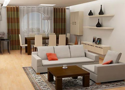
Are you a Minimalist? According to Wikipedia, minimalism describes a movement where "work is stripped down to its most fundamental features ... it is rooted in the reductive aspects of Modernism, and is often interpreted as a reaction against abstract impressionism and a bridge to Postmodern art practices." Strip it down to the fundamentals. Hide the clutter.
This Japanese style room is gorgeous and I am a huge fan of
plush cushions on the floor.
Notice all the geometric shapes the furniture makes in this room. The sofa, chair, and table form a square on the rug.
The green and orange colors are fun in this room!
The color scheme is even continued on the ceiling.
I have always been a fan of all white interiors and this one is no exception.

Saturday, February 27, 2010

Happy Weekend

Happy weekend! I have a whole list of fun things to do today... pick out paint colors for the addition, pick out flooring for the art studio and other rooms, run (training for the 10K) and then hopefully watch a good movie?
Any ideas for a good rental?

Friday, February 26, 2010

Beautiful Living : Jewel Tones

I am loving these bright jewel tone colors. Each piece of furniture has its own personality while keeping the rest of the room neutral.
image from flickr via tumblr

Happy Friday

This has been a busy week and I am ready for the weekend! Do you have exciting plans, or are you looking forward to some relaxation? Whichever the case, enjoy!

Thursday, February 25, 2010

Giveaway - Shop Gussy

** Update: Diane is the lucky winner... congrats **
I am excited to announce this giveaway from Gussy! She is offering one lucky reader a $30 shop credit to be spent at www.shopgussy.com. I love these bright and beautiful colors for Spring!
To qualify, leave a comment below, and
make sure you are a follower of BBB.
Winner will be announced sometime tomorrow!

Bold Vision : Erin Hiemstra

Erin is the Bold Vision behind Apartment #34. She came to the blog world to document her condo renovation. But of course, as luck would have it, life threw her a curve ball and she ended up in a totally different direction - new career, a new man and now only 2 months away from her wedding.
Her blog, Apartment #34 has turned into her place to share a treasure trove of inspiration for fashion, art, design and all things related to a stylish life.

Now she is chronicling her pending nuptials in Mexico in her Wedding Wednesday feature, showing us all how a destination wedding can be fully DIY. I love the honeymoon destinations post on Italy!
Thank you Erin for sharing your vision with us!

Wednesday, February 24, 2010

Giveaway On The Skirted Roundtable


Jackie Von Tobel’s fabric line, including these darling pillows.  The dog is NOT for sale!!! 


This week we have ANOTHER give away at the Skirted Roundtable HERE!  Our guest is Jackie Von Tobel, artist, interior and fabric designer,  and author.  Jackie is also a blogger – which is where the four of us met.    All of us started our blogs at about the same time, except for Linda who started HER blog ages and ages ago, Linda is the grandmother of design bloggers.   For the past three years, Jackie has been very busy writing two huge reference books on window treatments and bedding  HERE.   She was gracious enough to offer her two books for the giveaway.   The contest ends tomorrow night, so if you haven’t already entered, be sure to go to the Skirted Roundtable HERE and read the instructions.  
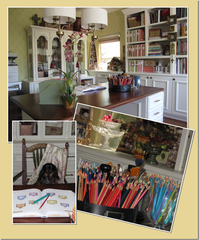


image I love these pictures of Jackie’s home studio, where she writes, draws the illustrations for her books,  and creates her fabric line.  What a neat and organized artist!


While you are entering the contest, be sure to listen to the interview.  Jackie is a fascinating woman, full of a joie de vie that most of us only dream about!!!   She is highly inspiring and I think you will be very motivated after listening to all she has accomplished in her life.  She’s an incredible person and the three of us were left a little exhausted after talking with her!!!


Birds & Branches ~ Coffee - Click Image to Close

My favorite fabric from Jackie’s line is this one – Birds and Braches in Coffee.   Jackie CLAIMS she designed this fabric with me in mind!!  Sure, Jackie!!!! 


Tomorrow is the last day to enter the giveaway – so hurry!!!  Go HERE to listen to the interview and leave your contest comments there.  Please do NOT leave your contest entry comments on this blog, Cote de Texas!  All entries MUST be left on the Skirted Roundtable blog or you won’t be eligible!!!!


Jackie asked that I add this information about her collaboration with Minutes Matter:

If you heard my recent interview on The Skirted Roundtable or read some of my posts about design software you may be interested in learning more about how my designs are used in STUDIO graphic design software.  My friend Merlin (yes, that is her real name) who is the official wizard over at Minutes Matter and I would like to cordially invited you to attend a FREE, 30 minute webinar sponsored by Minutes Matter Solutions on Thursday, March 4 at 1 PM Eastern. You’ll see Merlin use Studio, our graphic design program, to translate the fabulous draperies and valances from my book, The Design Directory of Window Treatments into elevation renderings filled with fabrics, colors, and textures. These complete designs can also be broken apart quickly and mixed and matched for an infinite variety of styles. Never be stumped again how to treat your client’s windows – watch how easy it is to drag and drop these beautifully illustrated images to create drawings that your clients will want show their friends.   To register for this free event on March 4 at 1 PM EST , please click here:

  https://www1.gotomeeting.com/register/240892040

for more information, please visit the Minute Matter website:

www.minutesmatter.com


And finally, next week we have design photographer Michael J. Lee who is full of tips on how to get that perfect photograph of your house! 

I heart Butterflies

Most of you know that I have a thing for butterflies... It was love at first sight when I stumbled upon this sweet pillow on Etsy!

Beautiful Living : Chandeliers

I found these sunny kitchen and dining room interiors over at Design Ties... The yellows and greens are bright and cheerful - my kind of colors! I will add them to my chandelier collection here and here. Happy Wednesday!


Tuesday, February 23, 2010

Home Renovation: Bathroom Tiles

Have you ever been tile shopping? I had the best time today looking around the gorgeous showroom of Morris Tile Distributors here in Richmond. I am looking for tile for the new bathroom on the third floor.
The blues and greens in the SenacaBlends collection are so beautiful and soothing. The colors remind me of the Caribbean waters.
I am amazed at all the different designs and patterns available to choose from. Aren't these fun?

Pretty Life Photography

Don't you love this whimsical piece of art from Pretty Life Photography? It's so full of life! Amy is a book cover artist. How cool is that?
You may view some of her work here.
More ways to follow BBB

Pretty Platforms

Bring on Spring, Swishy Skirts, Wide leg jeans and the Pretty Platforms...
Which are your favorites?

Monday, February 22, 2010

Decluttering my book shelf


While nothing is happening in our palazzo, I decided to do something in our appartment (where we actually live). Although the book shelf did not look too bad, I wanted to declutter it. Because I knew (what others could not see) that piled up pocket books were getting yellow behind more paperback piles. Travel guides were standing in two rows as well. There were books that I have read and will never read again. I only wanted to keep the books that I really liked - and maybe would read again.

So I started with the first cubicle and went book by book:
  • garbage --> pink box
  • give away to charity (or friends) --> white box
  • check and think again
  • keep --> back to shelf (after dust cleaning)
The pink box was filled up several times and I went several times to our paper recycling container. The white box was also overflowing at the end and I switched to a moving box. When I wanted to bring it to the church for a charity bazaar, I realised that most of the books where in English language. So I only brought the German books to the church and the English ones I gave a friend who works in the English liabrary and will use the old paperbacks for their own charity bazaar.

The only books I did not threw out were all my travel guides. Although there were lots of outdated Lonely Planet guides, I decided to keep them. Even the two from Cambodia, I kept them both. Maybe I am too sentimental. But aren't they documents of past times? My travel memories, including business cards of shops and restaurant.

Enough - here are my before and after pics:

before

before detail


after
Don't you see a difference ? Well, I have to admit, the second rows can't be seen in the before photo. But I know how many boxes I brought downstairs and how much lighter the book shelf feels now to me.

after detail
The travel section was not that easy : now I have Germany together with China, Italy goes with a rest of Italian books, rest of world and some Asia is combined while South East Asia has a cubicle for itself. There is potential for optimization. Next time.

Let's Get Nautical

More ways to follow BBB

Photography by Kat Evans

Happy Monday! Enjoy these soothing photos by Kat Evans to ease you into your week. She has an extraordinary talent with creating the right balance in her work. Kat uses the lighting, composition, and focus to create
soft and dreamy pieces of art...


Sunday, February 21, 2010

Enfilades and Lanternes

image Kay O’Toole’s house as seen in the March Veranda, pictures by Tria Giovan.  What roses!!!  I just adore the soft lavender color of the chair fabric.  Notice how thick the walls are, easy to see this where the windows are placed.


image  The enfilade view from the bedroom past the entry hall into the living room.  Notice the gorgeous doors!  The front of the house is on the left.


image
This picture of Kay O’Toole’s house taken from the architect’s web site shows the skylight and the design on the wooden floors – both elements that are found on the above floor plan. 


image A collection of antique oil paintings hang over a settee.  The chinoiserie tea table is so beautiful!

image
A charming French house found in Provence.

I have long been obsessed with enfilades – especially French ones found in the southern region of that country.   What exactly does enfilade mean when used in architecture?    Simply, an enfilade is a building where the interior doors are aligned with connecting rooms along a single axis.  When the doors are all lined up  – you can see from one end of the house to the other.   The history of the enfilade is a long one.  From the Baroque period on, royal palaces incorporated enfilades - state rooms would be lined up on one axis while private apartments would be on another.   Great houses in England used this floor plan – Chatsworth House and  Blenheim Palace are two famous examples. 


.
Chatsworth House’s state rooms are lined up on an enfilade, one room flows into the next with their doors placed in a long line.   Here you can see from one end of Chatsworth all the way down to its other end. 

 image
Blenheim Palace:  a long enfilade on the upstairs private bedroom wing.


image
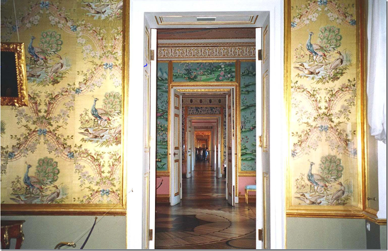
The 17th century Tsarkoe Selo, an imperial palace in Russia, has a particularly beautiful enfilade due the lavish wall treatments.  The Tsarkoe Selo is home to the famous Amber Room. 


Maison de George Sand, home of the French author, has an enfilade of rooms.


image Here, in this Swedish house, the enfilade is short, just three rooms deep.  So pretty!


Palaces traditionally have enfilades on their state floors. 


image
Juan Pablo Molyneux’s house has a gorgeous enfilade of rooms. 


 image Another Swedish enfilade.


 image
A country French house with beautifully carved doors between its rooms.


imageThe window at the end of this long enfilade is especially pretty. 


A modern interpretation of the enfilade by Thad Hayes who used beautiful doors to separate these rooms.


image
Another new version of the building style in Rosemary Beach – here arches separate the rooms, not doors.


`
David Adler, the famous architect, used enfilades in many of his designs.  This lineup of rooms is found in the 1925 Lasker house on Chicago’s North Shore.   Again, arches not doors separate the spaces.   


Limed wood doors and parquet floors update this house, giving it a more contemporary look. 


c image
Not France, but America by William T. Baker, thanks to Things That Inspire.   I would love to see the plans of this house to see if it is one room deep.


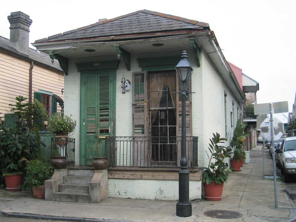
Traditional enfilades are not always fancy or large.   The New Orleans “shotgun house” is such an example.  Here, in the French Quarter,  is a rare but charming shotgun house, so called because a bullet would travel from the front door out to the back.

image
The shotgun house floor plan is a enfilade – all its doors are lined up.  The view at the front door would end at the back yard.


downloading...
    Enfilade is also another name for a buffet with cabinet doors. This 19th century French painted enfilade with original hardware is from M. Naeve in Houston and 1st Dibs HERE. 


image
Kay O’Toole’s Floor Plans:   Enfilade AND a Lanterne

Looking again at Kay O’Toole’s floor plans, they reveal that besides being an enfilade, the house is also an example of a French Lanterne - meaning, the house is one room deep and the front and back windows are lined up – making the house see-through.  This style of house is named after the famous 18th century hunting lodge, the Pavillion de la Lanterne, located in the Versailles Park in France.   La Lanterne is considered a  most beautiful house and it has been widely copied throughout the years by different architects.   


image An earlier picture of La Lanterne.  The house is used as a country vacation spot by French President Sarkozy.   He spent his honeymoon there with Carla Bruni.   The romance of a Lanterne design is the ability to approach the house, look into it and out past it, onto the back yard.  Imagine at a dinner party, arriving at the house and seeing through it, straight to the back all decorated with candle lit tables.


image The gates to La Lanterne are topped by large deer heads. 


image A rare floor plan of  La Lanterne shows the courtyard its the two wings surround.  Here you can see the center part of the building with the windows that line up, making the building see through.  


image The layout of La Lanterne.   The famous blogger Aesthete’s Lament commented HERE that this view shows the “dreary landscaping, vulgarly sized tennis court, motel-blue pool.”  It does seem a shame that the grounds are not prettier. 


imageHere is a larger satellite picture of La Lanterne in Versailles.   You can see how close it is to the palace and the Petite and Gran Trianons.  
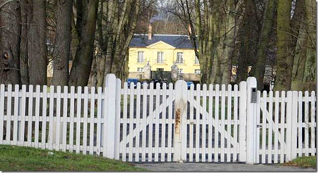


image Security is very tight at La Lanterne now.   There is now a metal gate between the deer head posts.  Another fence encircles the outer perimeter of the property.


image
Rare pictures of La Lanterne.  You can really see the essence of the see-through aspect of the house from these pictures. 


image The tennis court does seem horribly oversized – couldn’t it be moved to a more discrete part of the estate?  The pool, though, is not as offensive in this picture. 


image
A closer view of the two wings.


image
Many grand houses were built modeled on the original Pavillion de La Lanterne.  Here, in Lake Bluff,  the Carolyn Morse Ely house was built by David Adler in 1923.   Notice how the screens have marred the beautiful windows!   The facade is a faithful adaption of the original Pavillion de la Lanterne with its six windows and center pediment.


 image The Adler Ely house showing the opposite side of the house as above.


 image
The floor plans of the Carolyn Morse Ely house, plainly showing the house to be a Lanterne design with its windows lined up with each other.  The center portion of the house is also an enfilade, all the rooms have doors lined up on an axis. 


image
In Newport, Champ Soleil was built, again based on La Lanterne.  Things That Inspire  took this picture on a tour of the neighborhood.   Again, the main section of the house is one room deep, with windows lined up from the front to the back, making the house see through.  The gates were recently refurbished at great cost to the homeowners. 


image
An earlier photograph, taken inside the gates show the shutters and front door stained.   Champ Soleil is not as faithful a reproduction as the Ely house.  The Ely house has six windows flanking the front entrance, exactly like the Pavillion de la Lanterne.  Champ Soleil has only one window flanking the front door, instead of three. 

 image
This side elevation picture of Champ Soleil dramatically illustrates the one room deep aspect of the Lanterne design.


image In 1929, Horace Trumbauer designed another La Lanterne inspired house on Long Island for James B. Clews.   In 1952 the “Lanterne” center part of the house was demolished leaving the two wings to be converted into separate houses.  This facade is a faithful adaption of the original design – there are three windows on each side of the front door, exactly like the Pavillion de la Lanterne in Versailles.


image
The architects Bories and Shearron HERE designed a wonderful house based on the ‘see through’ style.   Sadly, this house has not yet been built.  This plan is not a copy of the Pavillion de la Lanterne, rather it is an interpretation of the style.  Notice the front door is not symmetrically placed, instead three windows are to one side of the door, while one is to its right.    


image                                                                                                                                               
   And finally, a plat showing the layout of the house and gardens.


image
Reminder:  the new Skirted Roundtable is now online HERE.  This week we have as a guest, Jackie Von Tobel, author, interior and fabric designer.  Jackie is very inspiring to listen to – I think you will really enjoy hearing how she manages to do it all!   We are having a giveaway this week – two people will win one of Jackie’s reference books on bedding and window treatments!  Hurry to enter!