Friday, August 31, 2007

Point of Departure


When I was in Pizzo this summer, I posted that the house looked worse than last year when we bought it. Did you read that? Did you believe me? Those of you who still associate the Italian word palazzo with a glamorous palace got the wrong idea.

In Italian casa means 'home'. It can be a 'house' or an 'apartment'. A villa is a big house with a big garden. And a palazzo is a big house with no garden. Italians have nice sounding words for simple things and our palazzo is far from glamorous.

I reported that almost all window glass was broken. Probably kids threw stone at the windows. Of course some of the glass was broken before and all windows need to be replaced anyway.

Wild plants are growing on the floors of several rooms inside the house. Outside they grow on the walls as well as on the terrace and the balcony. Rain water is following their roots. We need to isolate the house well to avoid the penetration of rain water.

And last but not least more graffiti was on the doors.

I hope that all this 'wildness' will fade soon after we have the permission to start the renovation works. The permission is expected to be given in September. Let's see if the architect can keep his promise :)

Thursday, August 30, 2007

O at Home

The new issue of Oprah's magazine O at Home is on the stands, and usually, it's not exactly something I would blog about. But isn't this cover beautiful? I adore it and it really caught my eye today! Gosh, I wonder why? Could it be because of the ultra-chic woman pictured below?


Probably. Thanks to my favorite fashionable blogger from New York, the fast-becoming famous Habitually Chic, I already knew Charlotte Moss was going to be in O at Home this issue. Those of us who devour every word Habitually Chic writes, were informed by her that Charlotte's new "must see" store in NYC had been photographed by Oprah's staff. This picture of Miss Moss was snapped by none other than Habitually Chic herself at their meeting last week. In case you missed this interview, read it here.

The current O at Home is wonderful, for reasons other than Charlotte, but she is certainly the star. I'll give you a sneak peak of the bedroom featured on the cover. It's typical Charlotte and it's to die for! Enjoy.


No one does four posters better than Charlotte. Styled to utter perfection, the photograph is typical Moss, with attention paid to everything, down to the smallest detail.

Wednesday, August 29, 2007

Guardian Statue by Annechovie

My very second post to my blog, Cote de Texas, was entitled Concrete Statuary and in case you missed it, this was the post:


My favorite shape is the urn, as in a crusty, old, concrete garden urn. I love placing urns inside the house with or without something inside of them. Another accessory I love using inside the house is garden statuary. This lady has been guarding my front window for many years. She is not an antique, but a copy of one. She is concrete, of course. I abhor all those "light weight" fake concrete items on the market today and would rather pull my back out moving real concrete than using the faux thing. My lady had been in the corner of the window for years, but recently I moved her to the middle of my window, framed softly by the silk curtains. She's much happier now that she can be easier seen.

Ok, ok, like I said, it was one of my first posts! Hopefully they got better along the way. Truthfully though, I've always liked that post because I adore the picture that accompanies it. I like the way the statue is framed in the draperies, I like the lighting, the glimpse of my tree outside the window - I was proud I had taken this picture.

And so, when I noticed that quite a few of the design bloggers were having an artist paint a special vignette, I wanted a painting too! The question became, of what? Style Court had had her newly upholstered chair immortalized, Patricia Gray chose to have a client's room painted, and online, there were renderings of pictures from design magazines that I liked. The artist behind this work is none other than Anne Harwell, aka, annechovie. Anne takes commissions for her renderings of interiors in the Mark Hampton style, but she also does exteriors or anything else you might want. If you have a special "view" you like or perhaps you have something else in mind you would like painted, Anne is more than happy to work with you to create exactly what you want. She's very pleasant to work with, sweet, kind, and most importantly patient while you make your final decision. My experience with Anne was first rate and I highly recommend her. To see all the work she has posted online, visit her Etsy store here. Below, is Anne's lovely vision of my guardian statute.


Anne, thank you so much, I adore my piece and I am most grateful to you!


Joni

Monday, August 27, 2007

Pizzitani


Pizzitani who had to leave Pizzo must feel homesick for the rest of their lives, until they can come back to this special place on earth between the sea and the sky.

I just came across this picture (I am working on our bathrooms, yes me too) and I stared at the photo for several minutes... thinking of all the Pizzitani (people from Pizzo), who had to leave this beautiful place on earth to find work somewhere else. And lucky Pizzitani who live here and cherish the value of life in Pizzo.

(Picture courtesy by CC, my husband)

Sunday, August 26, 2007

I was Tagged

I have been tagged lately by Katiedid and South of the Sahara. Thank you for showing interest in the blogger behind this blog. I owe you answers.

Here are EIGHT THINGS ABOUT ME:

- I am very happy and thankful to have seen a lot of this world. I am German and have lived 32 years in Germany before moving for 5 years to Thailand. Now, I am living in China since 2 years. For my work I have travelled to over 20 countries, where I spent a month in average. My favourite countries are Ireland, Thailand and Italy. My favourite city for many years was Paris.

- It happened to me to fall in love with an Italian whom I met in my hometown Stuttgart. He looks more Scandinavian than Italian and I am the one with the ‘Italian’ temperament in the family.

- I do not care about brand names and I own less pairs of shoes than my husband (well, he is Italian).

- I suffered from asthma when I was little. For many years I could not run as much around as other kids because I could not breath. With swimming, lots of swimming and even more swimming I was cured when I was about 11 years old.

- Although I was a real good and talented swimmer, I was playing tennis daily for many years and I loved skiing, I have lost my interest in these sports. Maybe I have overdone it. Maybe I am just too lazy.

- I met Keanu Reeves in person once. He looks even better in reality than in the movies or pictures. Although he has a fantastic voice he does not talk that much - same as in the movies.

- I am ‘collecting’ languages. At school I learned first French, then English and Latin. French and Latin helped me to learn other languages like Spanish and Portuguese (which I lost after not using it). I learned Italian to be able to communicate with my new family (which made me loose my Spanish). I know some words in Japanese, Bahasa (Indonesian), Dutch, Swedish and Danish. Nowadays I am trying to learn Mandarin as every other foreigner living in China does. Besides my German mother tongue, I am best in French, I think.

- Although I dreamed of becoming a graphic designer, painter or writer I choose to study the more ‘safe’ economics. 20 years later, I am now changing my ‘destiny’. Two weeks ago a resigned from my old job (that was on hold) and feel free now, to do what I always wanted to do. First of all I am writing in blogland, here and there. And maybe other dreams will come.

I found eight things about me. So I am done. Who else wants to join the game? You are tagged, tell me!

Friday, August 24, 2007

Check Mate!

One of my favorite fabric houses these days is Chelsea Editions or Chelsea Textiles, depending upon which side of the pond you are located. Chelsea specializes in hand embroidered fabrics made in India. Besides selling fabric, they also sell reproduction furniture based on Swedish antiques. Though Chelsea is famous for their embroidered fabrics, it's their check fabrics that speak to me. Chelsea sells checks in every colorway, but, apparently, they must not be very proud of them because the checks are absent from their web site! Despite their second class status, I've become check crazy. I recently came to this conclusion looking around my house and going over projects I've worked on lately. I just can't get enough of checks. Here's what I mean. This is my sitting room with it's checked daybed and checked french chair:

And here's my unfinished bedroom with it's Chelsea checked headboard and drapes:

And here's a client's Swedish sofa that I covered in a Chelsea check:

And here's a pink Chelsea check:

Oh, look, here's a taupe check:

And here's another Chelsea check on the bench and a Chelsea embroidered duvet.

I'm not the only designer who loves checks. Mario Buatta has a thing for them too. Here he uses a check on the settee:


And here in a Houston home, Buatta uses a red check for the draperies:


Buatta must like big scaled checks, he uses a yellow one for these draperies:


Mariette Himes Gomez uses checks in the traditional way, on the back of a French fauteuil:

Someone who loves checks more than me, New York designer Jeffrey Bilhuber surprised people with his excessive use of checks in his new apartment:

Bilhuber's dining room:

Houston's Michael Siller also covered an entire room in his house with checks. Do you think he inspired Bilhuber?

Dallas designer Cathy Kincaid uses checks to line the bed's canopy.


Michael Smith is known for using this blue and white check in his designs. It shows up again and again:


Kathryn Ireland uses checks alot, also. Here she uses a dark blue check to contrast with the all white French styled bedroom:

In this vintage photograph, socialite Gloria Vanderbilt sits under one of the collages that she was famous for making. The check in the collage matches the fabric on the couch. The two matching Venetian mirrors are drop dead gorgeous! Playing next to her are her two sons. One is the famous CNN reporter: Anderson Cooper. Are you aware of what happened to the other son?

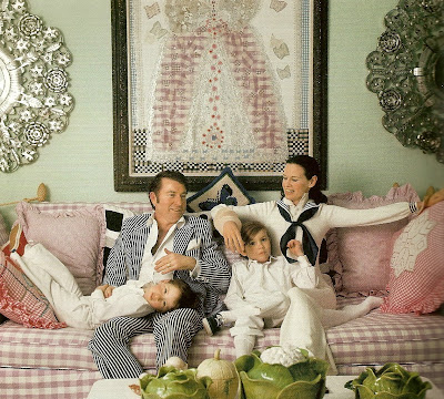
In France, checks are frequently used as a secondary fabric to toile:

John Stefinidis, interior designer extraordinaire, likes to use checks:


New Orleans' Gerrie Bremermann uses checks often. Here one shows up on the duvet:


Houston Designer Ginger Barber uses a check as the only pattern in an otherwise neutral room:


Despite the luxurious fabrics used in this room, a simple check shows up on the pillows:


Interior Designer Diane Burns uses silk checks in her French styled bedroom:


A checked fabric livens up a bedside bench:


Victoria Hagan puts the check on the floor with an Elizabeth Eakin rug:


Here, Ikea gets in on the check act with it's slipcovered sofa:


And finally, here on Chelsea Edition furniture, is, of course, a Chelsea Edition check!


Thursday, August 23, 2007

Southern Accents


There's nothing more exciting to me than going to the store and seeing a new issue of a magazine I love. And I do love Southern Accents. The new issue is not to be missed. It's the 30th Anniversary issue with loads of old photos and commentary by people such as Bunny Williams, Julia Reed, Jackye Lanham and others. There's even a book review of Bunny's not yet published new one, along with a review of Axel's not yet released book. Page after page is wonderful, eye candy every one. The featured homes don't disappoint either. First is one designed by Beverly Jacomoni, a Houston favorite. This house was featured in the very under-appreciated book by Mary Emmerling, Romantic Country (a personal favorite). Also featured is Suzanne Rheinstein's home outfitted with all new fabrics from her just released Lee Jofa fabric line. Her interview is interesting and thoughtful. A third showcased home is a Dallas mansion designed by Cathy Kincaid. I know a lot of people consider Southern Accents a "regional" magazine, and it is, to the degree in that Southern designers are featured, but these southern designs should not be missed by those in other parts of the country. If you don't read the magazine, this issue may be just the one to change your mind.

Pictures from Mary Emmerling's book, Romantic Country, that show the house featured in Southern Accents. These photos aren't included in the magazine, so I add them for your viewing pleasure. This is the outside of the gorgeous New Mexico home with interiors by Beverly Jacomini. It's a single story home, originally built for an artist. I love the landscaping with the purple perennials.

Here is a shot of the living room showing the slipcovered antique settee, window seats, French furniture and antique tapestry.


A picture of the master bedroom. In the magazine, the Bennison bedspread has been replaced. I suppose it's to present a newer version of the decor, but I much prefer this spread to the new one. I love the Fortuny drapes that divide the bedroom from the sitting room. The headboard is to die for!


Here's a peek at Suzanne Rheinstein's breakfast room. The chair is slipcovered in her toile that is the highlight of her new Lee Jofa collection. In the magazine, Suzanne describes exactly how this toile came to be in her line. It's interesting, because she admits she didn't exactly design it! I love this toile and I'm on the hunt for a client willing to use it. Takers, anyone?

South Italian Facades and Doors

When you have to choose a color for your house's facade, windows and doors, you look around to get inspired. So I looked around in Pizzo:


We are also a bit restricted by the village's regulations for the historic center. The window frames should be brown. Most of the palazzi have another frame on the facade around the windows which is painted white. That makes the facade look even better than white window frames framed with white color. Some facades in the mosaic do not match the (new?) regulation.

--------
(Remark: picture no 3, first row is taken in Tropea, another village with other rules for colors of window frames and shutters).

Wednesday, August 22, 2007

What did we do all summer?

We have been looking for the things first to do:

- roof tiles
- windows
- doors
- tiles
- facade
- interior walls

Most important: To close, isolate the house.

1) roof tiles: we agreed with the architect to use new clay roof tiles that look 'antique'. The color of the tiles will be clay / slightly orange. This is a regulation of the city of Pizzo for the hioric center. Roofs must have the same harmonious look.

2) windows: we had three different manufacturers coming to the house and doing measurements for a bid. Although the one who wanted to do everything different from our idea, didn't came up with a bid. We had to decide about the material (aluminium or wood or both) and the colour. We choose aluminum for the outside in order to have not to repaint the frame regularly. The colour for the outside frames, again, is regulated by the city. It should be a wooden brown colour. Some of our neighbours did not follow the rule. However I got used to the idea, as the windows have another white painted frame on the facade. We choose the fake wooden structure instead of a plain brown RAL colour. Angelo said, this looks better and I had let me persuade. For the inside, we choose wood and for the colour we changed our mind in the last minute. Instead of a natural brown we decided to have the frames painted white for a more elegant look.
The scuri, the shutters, that are before the window on the inside (not outside) are going to be white as well.

3) doors: we have three entrances. The manufacturer that makes the windows will do the doors. The architect proposed to draft a design. They will be wooden from the outside, cherry brown as I remember.

4) tiles: I posted about the tiles before that we ordered for the terrace and the balcony only (no bathrooms yet). We choose a light blue watercolour tile (40x40cm) for the terrace (70m2) with a hand painted border tile that goes all around the terrace - and costs as much as the tiles for the whole balcony(!) My husband insisted. For the balcony we will use the same tiles, just in a different size (30x30cm) and no border. The balcony is wide (11m) but not equally deep (2-3m) for this kind of decor.

5) facade: we defined how much, how less respectively we would like to renovate the facade and which colour to use. I think for choosing the right colour someone has to travel back to Italy to make sure we like the house at the end!

6) interior walls: we will knock down two walls on the ground level in order to open up the space between the living, dining and kitchen area. And we have to displace a wall in the first floor in order to enlarge a toilet that will become an entire bathroom.

So we signed the orders and the contracts needed just before August, when whole Italy is on the summer holiday.

In September/October things will start.... hopefully according to Angelo's 'execution program'.

Sunday, August 19, 2007

Shutters Hotel on the Beach


If you plan to visit Los Angeles and want to spend the night enveloped in esteemed interior designer Michael Smith luxury, Shutters Hotel on the Beach will fit the bill. Recently, Mr. Smith spearheaded a total redesign of the charming Cape Cod styled hotel, and it shows: Smith's touches are everywhere, from the checked and striped fabrics, to the luxurious bathroom fixtures to the beachfront restaurant - it's Michael, all the way. Shutters is located in Santa Monica and as it says, it's smack on the beach. The hotel takes its name from the multitude of shutters that cover the rooms' windows. If you go, be sure to visit the hotel's store. Among available items you can buy is the bedspread, made from a beautiful John Robshaw fabric! Enjoy!


Does it get anymore Michael Smith than this? A checked chair in every room. Notice the fashionable Oriental garden seat and wood floors.


The rooms feature two flat screen tvs, one in the bedroom, the other in the bathroom. I could be very happy in this bedroom.


Smith is famous for four poster beds and he doesn't disappoint here. Cute guy is available from room service.


Close up of Tibetan rug. It's available for sale in the hotel store.


The striped fabric headboard appears to me to be Rogers and Goffigon Cyclades.


Close up of the John Robshaw fabric bedspread available for sale in the hotel store.


Gorgeous Smith bathroom with spa tub. Notice the window from the tub to the bedroom.


Smith redesigned the hotel spa with rain shower fixtures.


Beach front restaurant with typical Smith stripes, wicker, and wood.


Smith uses casual white denim slipcovers on the wicker dining room chairs.


The redesigned lobby.