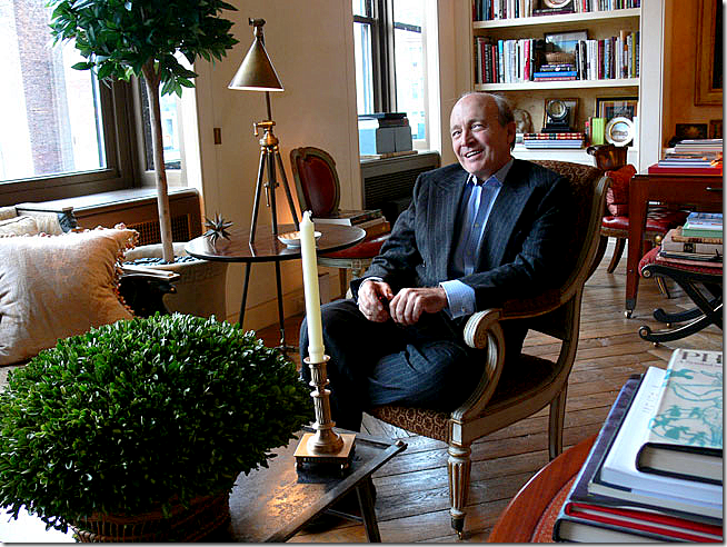
The handsome and debonair David Easton in his NYC apartment courtesy of NYSD HERE. Easton confesses his trees are artificial. Gasp!!
David Easton’s former country house was a wonderfully decorated enfilade – filled from one end to the other with masses of English, French and Swedish antiques. Once he decided to sell the property, the entire contents of the house were auctioned off. Easton, a renowned architect and interior designer has had a long and very successful career. He started out working for the legendary Edward Wormley, which he followed up with a stint under Parish/Hadley. At one point he even partnered up with Charlotte Moss – a relationship that didn’t last very long. Today, he works for himself.
Balderbrae: Easton’s former estate. The main living room/dining room is located in the central block. The bedroom and study is on one side, the kitchen on the other.
Along the way, Easton has designed some of the biggest and more impressive houses in the country – including the famous Kluge mansion, Albemarle House. Needing a place to get away from it all, he and his partner Jimmy Steinmeyer, the artist, bought the country property in 1980. Named Balderbrae, the estate is located in Suffern, New York, only 45 minutes from NYC. The original 1910 stone cottage and overgrown garden greatly appealed to Easton, but the accommodations proved too small. To make the estate more functional, Easton then designed and built the shingled and stone enfilade across from the original structure, which was turned into a two bedroom guest house. A swimming pool was built between the two houses. The grounds were magnificent with a large alley of trees that overlook a state park. The pair lived at Balderbrae for twenty years, during which time, the house was published in several design magazines. When it came time to move, an auction was held in 2007 at Doyles- the final sales totaled $1,607,140.00.
Easton’s collection was varied, from the fine to the rustic. The finer items came from places like English castles and Colefax and Fowler. Several pieces were bought from Geoffrey Bennison. The famous Dutch chandelier hanging in the main living room sold for $12,000.00, while an Italian chandelier so popular today sold for $24,000. The large mirror in his bedroom, designed by Easton and later reproduced, sold for $12,000 – its value was only $4,000. Many of his pieces are trendy today – like his Swedish chairs and sunburst mirrors, yet he had bought them decades before.
Easton and Steinmeyer took their riches and settled into their NYC apartment. They are planning to move to another country house – this time a modular home, with a similar floor plan to Balderbrae – located in Canada, north of Montreal.
So, you might ask, whatever happened to the beautiful Balderbrae????
OY.
Don’t ask.
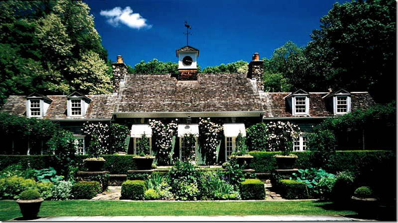
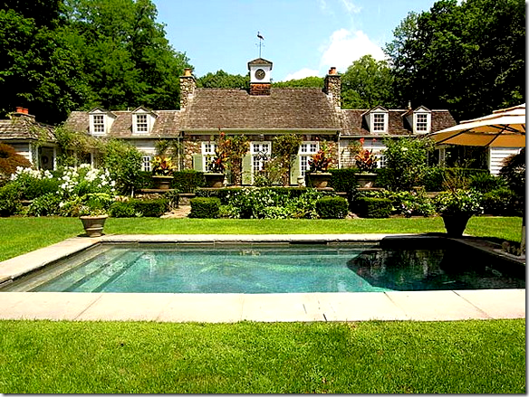
The enfilade house, built by Easton has two open air wings, one for sitting, one for eating. The swimming pool was built between the new house and the two bedroom original stone cottage.
Here, you can see one of the open air loggias – with a fireplace. The shingled and stone house was built by Easton to look like the original structure – also made of stone.
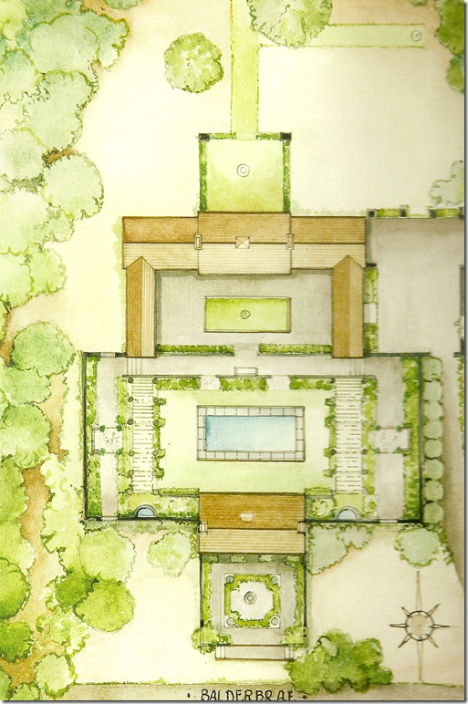
A painting of the landscape design of Balderbrae. At the top is the new enfilade with the two open air wings. Surrounding the pool is a stone wall, original to the property. At the bottom is the original stone cottage.
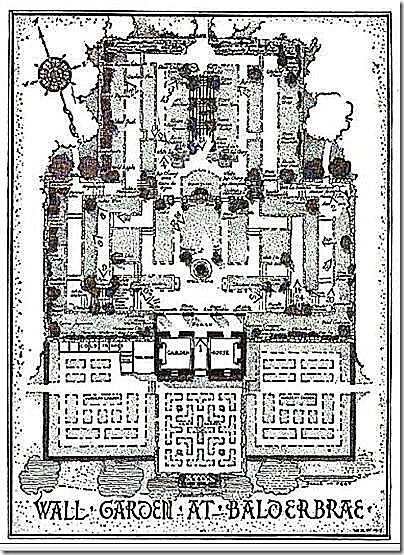
The drawings for the original walled garden at Balderbrae, designed by its owner Louise Beebe Wilder, an important figure in American gardening history. Wilder was married to an architect who worked with McKim and White. Back then Balderbrae was over 500 acres, not the 5 acres it is now. Wilder wrote 10 books on gardening and is a legend with gardeners today. The fact that the property was owned and developed by Wilder was one of the main selling points for Easton. At the time he bought it – the gardens were totally overgrown and unrecognizable. He spend years getting them back in shape.
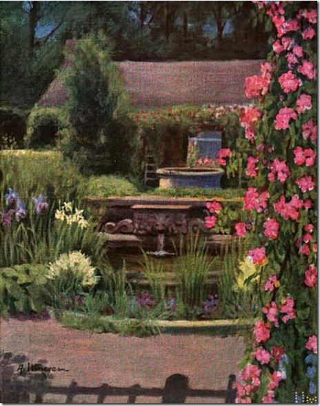
In the 1918 book by Wilder, Color in My Garden, the half moon shaped fountain is illustrated. The fountains are still on property today. Color In My Garden is about one year in her garden at Balderbrae. The book is available to read online at Google Books - in its entirety – along with all the illustrations HERE.
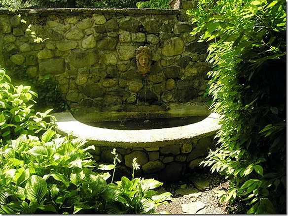
One of the two half round fountains as they are today.
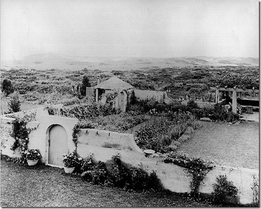
The walled garden at Balderbrae eerily reminds me of the walled garden at Grey Gardens in the Hamptons. Here - an early picture of the original Grey Gardens Walled Garden designed by Anna Gilman Hill. Hill also wrote a gardening book about her own garden Grey Gardens, just as Wilder had with Balderbrae. Even the pergola at Grey Gardens is remarkably the same looking as Balderbrae’s! To read more about Grey Gardens and its famous walled garden – go HERE.
A view into one of the two open air loggias.
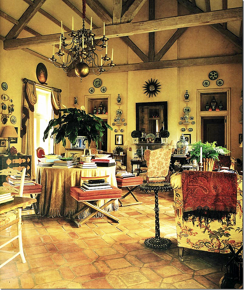
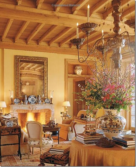
The gorgeous living room/dining room at Balderbrae. One large room – Easton has often recreated this furniture plan with a large round center table dividing seating areas. Furnished almost 30 years ago, the room looks remarkably current due no doubt to all the classic antiques used. I remember the first time I saw this house in pictures – I fell totally in love with it and today still feel exactly the same. It’s perfection! Note: next to the chair on the right, the side ebony and ivory Victorian table is one of pair bought from Geoffrey Bennison. At auction, the tables went for $27,000.00
An earlier shot – the color is off in these pictures. Just as an English country manor would have evolved over time, Balderbrae also evolved over time as Easton collected more antiques and filled the room with masses of books and porcelains.
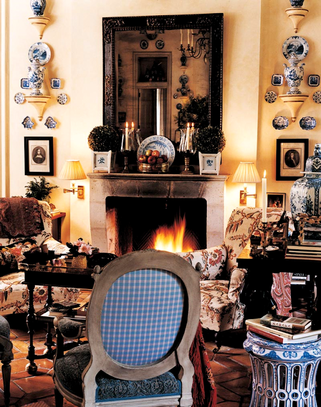
A close of the vignette by the fireplace. The Dutch table in front of the chair sold at auction for $18,000.00.
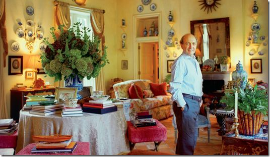
A photograph of Easton in his living/dining room. It’s interesting to see how different flowers and pots are used on the center table. I love the pops of cranberry velvet on the stools and the pillows. This is probably the correct wall color – not such a bright and strong yellow as seen before.
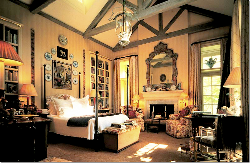
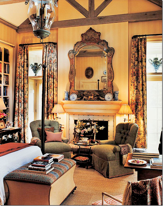
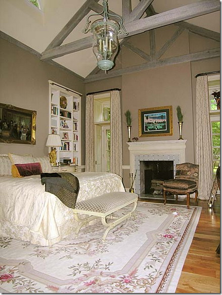
The master bedroom – located off the living/dining room. The large mirror, designed by Easton, is still in production. It was valued at $4,000 – yet it sold for $12,000. The ceiling with the limed rafters was designed to mimic the living/dining room. Because the ceiling was so high, Easton needed a larger than available lantern – he designed this bell lantern and had it made to his specifications.
Seagrass – wall to wall! Easton’s bedroom is different here than above - fabrics for the curtains and chairs. A different bench is in front of the bed. I love the vases above the windows. Notice in the mirror – the cameo above the door! Here it looks like the wallpaper is a soft yellow stripe.
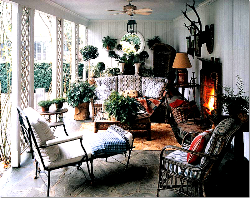
Open air loggia – one of two. This one, with the fireplace, is an outdoor living room. Easton later changed the fabrics to his own from Lee Jofa, see below.
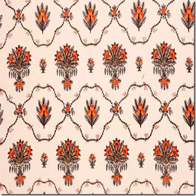
Lee Jofa’s David Easton line includes fabulous outdoor fabrics.
Les Alpilles by David Easton for Lee Jofa comes in several colorways.
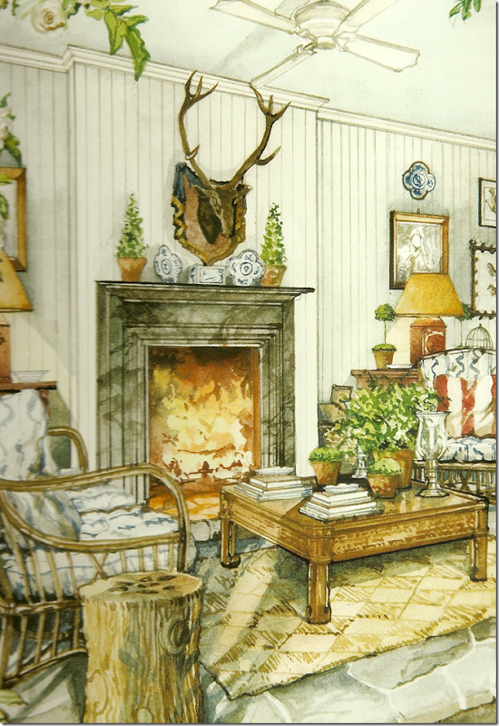
David’s partner Jimmy Steinmeyer is a fabulous artist. You might recognize his work from Charles Faudree’s books which he illustrated. Steinmeyer also works for Easton - doing all the sketches and drawings for the client presentations. His work is also seen in Easton’s new book, just published, called Timeless Elegance.
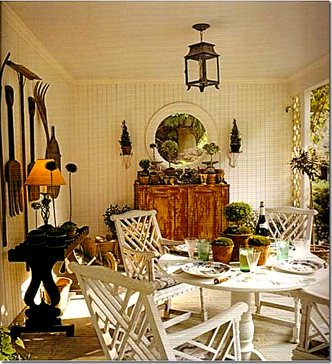
This is on the dining porch. The eight chairs were auctioned off for $20,400!
So, whatever DID happen to Balderbrae after it sold in 2005 for $1,500,000+? Who bought it? Did they update it? Did they decorate it? Are the gardens being kept up?
Like I said before - DON’T ASK!!!
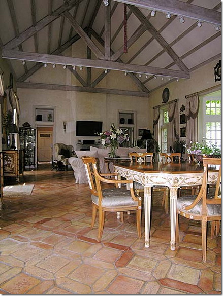
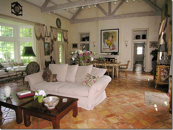
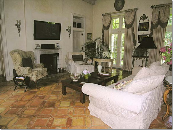
Amazingly, the house is now available for photo shoots – for magazines, design books, advertisements, etc. My thoughts: It looks as if the house is truly lived in – not used only as a weekend home. It also seems as if the house was furnished with previously owned furniture – it doesn’t look like it was professionally decorated with this house in mind. The great room was painted a soft gray to go with the beams. I actually like the new paint color. The large living/dining room is in desperate need of several area rugs to soften it a bit. The curtains appear to be the same ones that Easton had. The biggest disappointment is all the spotlights hanging off the rafters! What are those?!?!?!? They look like barnacles clinging to a piece of driftwood!!! And the flatscreen over the fireplace – some other solution should be found, either hide it in a cabinet or put a picture over it. It looks terrible.
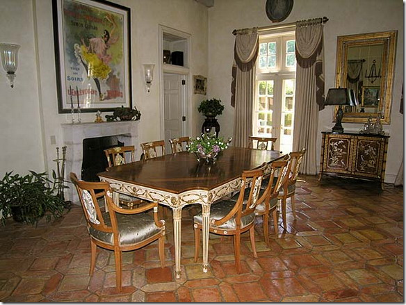
The view towards the dining area of the room. This just makes me so sad. Remember the beautiful porcelains Easton had above the doors? Now there are dark boxes on display that add nothing to the décor. I actually like the white and gray – and think that this color scheme could look gorgeous with the beams – it just needs a professional touch, or something, anything? (Love that Todd Rundgren album.)
The flatscreen is just awful. Perhaps a cover could be built over it or a painting put over it to disguise it? Look how Brooke Giannetti of Velvet and Linen handled this issue:
In this room designed by Brooke Giannetti of Velvet and Linen fame – the framed painting actually rolls up to reveal the flatscreen! Amazing. HERE.
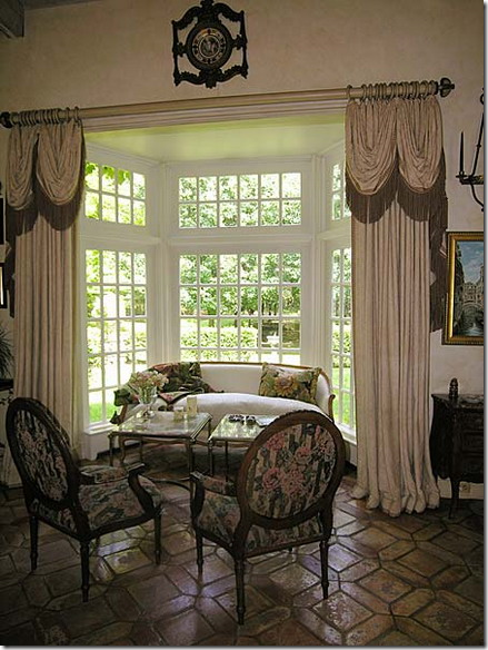
In the bay window – I like the white French settee. The curtains need to be updated – they are too creamy to go with the gray/white walls.
The dining room table is really pretty, but seems much too dressy for this country house.
A rare shot of the kitchen with its own fireplace.
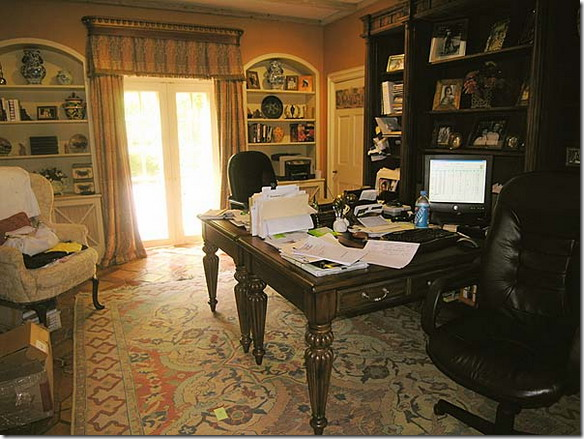
The study off the bedroom – I’ve never seen this room. Now, I ask you – if you were advertising your home as a rental for photoshoots – wouldn’t you at least clean off the water bottles from the desk and put away the dirty clothes in the chair and pick up the post-note off the carpet?
The master bedroom – I love the wall color here. I am shocked that Easton didn’t sell the custom lantern he designed in the auction! These are the same curtains used in the Easton bedroom.
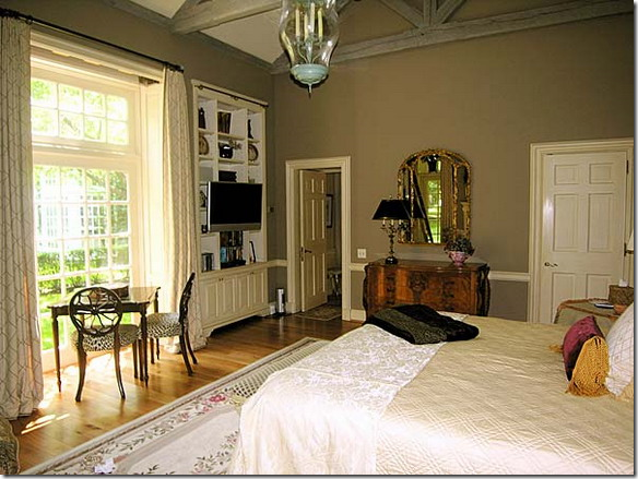
A rare view looking the opposite way in the master bedroom.
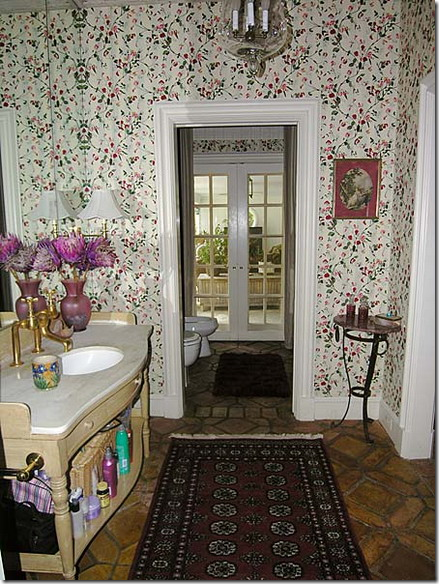
The master bathroom – I am assuming this is how it looked under Easton. Notice that the French doors lead directly to the sitting area loggia.
The wood bath tub – so unusual. Pretty hardware.
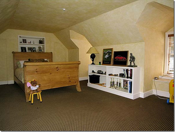
Never seen before – room above the kitchen wing.
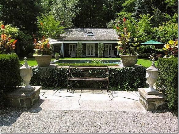
Louise Beebe Wilder’s original stone cottage – now a guest house. To the left is the original vine-covered pergola. I love how the swimming pool is just sunk into the ground without wide sidewalks around it.
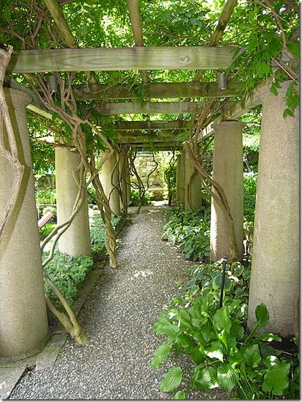
The original pergola with gravel pathway. Mr. SlipperSocks Man just looked over my shoulder and said “that’s so pretty!”
A view from the front of the main house, looking towards the original stone cottage. Here you can see the original walled garden – the wall is now covered in ivy.
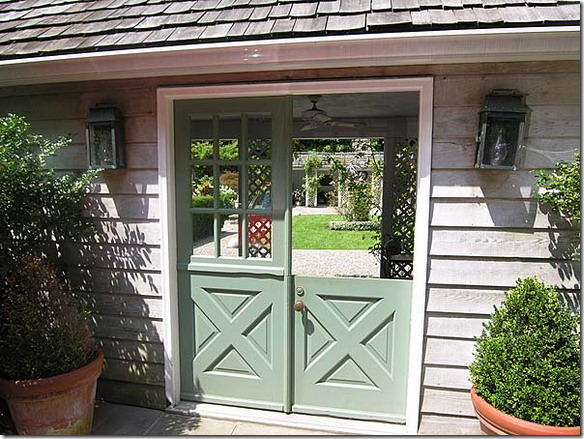
These Dutch doors lead from the loggia to the parking area.
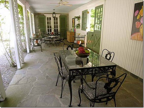
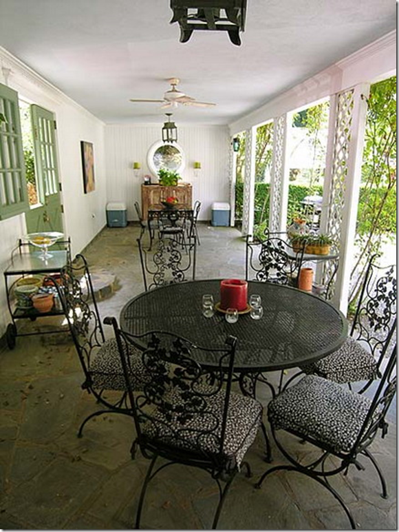
The eating loggia – not much to say about the décor. It just can not compare in any way with the way it looked before!
The lanterns remained here from Easton as did the buffet on the back wall – now decorated by huge, flanking ice chests!
And, here’s the other loggia – next to the master bedroom – complete with a sewing machine in case the mood strikes.
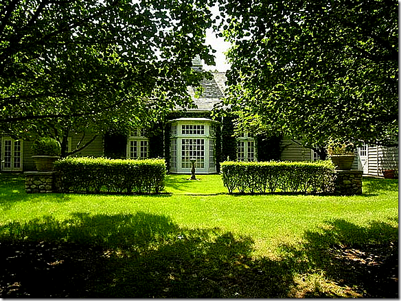
Rarely seen back side of the house – with the large bay window. Notice how the grounds seem unkempt and overgrown now.
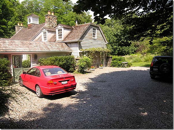
The parking area outside the loggia on the kitchen side of the house. There is also a two car garage on the 5 acre property.
The original stone cottage has a long porch overlooking the swimming pool.
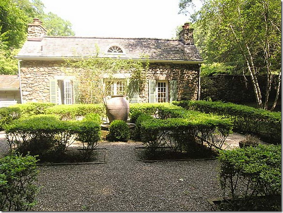
The front view of the original stone cottage. You can see here that even the grounds haven’t been kept up.
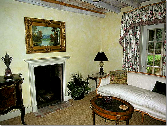
The living area of the original stone cottage – notice the ceiling. This is my favorite room in the estate as decorated now. So charming!
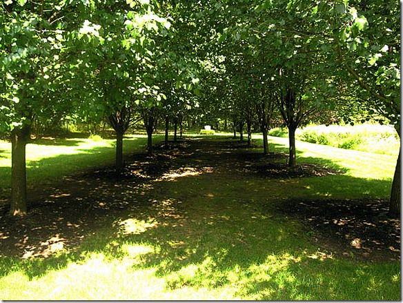
The long alley of trees. The original house was built and the grounds were designed by Louise Beebe Wilder.
Life Goes On For Easton: David Easton and Jimmy Steinmeyer left Balderbrae and moved into an apartment in NYC. Easton is now building a modular house on acreage he owns north of Montreal. His book Timeless Elegance was just published, showing many of his most famous projects and Balderbrae is, of course, included. Mr. Easton is scheduled to be a guest on The Skirted Roundtable in the next few weeks and we are all so excited to interview him! Hopefully he will have lots to say about Balderbrae, but then again, maybe he won’t want to look backwards.
NYC:
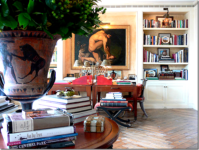
The NY apartment where Easton and Steinmeyer have lived for the past 10 years. Easton hints that he is ready to move. The large painting is a copy of an original the he commissioned. And notice, the round center table – a true trademark of Easton’s.
A peek at his closet with the sunburst mirror. So organized!!! Nary a sneaker to be found.
VIRGINIA:
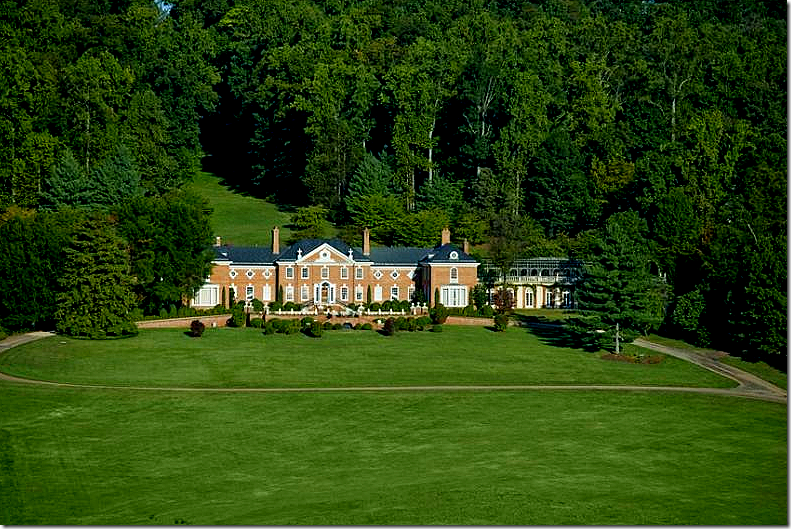
One of the most famous houses Easton designed is Albermarle House – built in Virginia for Patricia and John Kluge. This project is over 25 years old now – and remains of his most heralded works – taking over five years to complete. The house was for sale for $100,000,000.00 – but recently was reduced to $48 million –a steal! Easton was the architect and interior designer on the project. Emily Eerdmans has a great article on the house HERE.
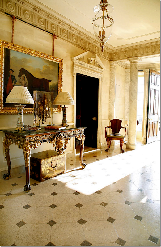
The marble floored entry hall at Albermarle House.
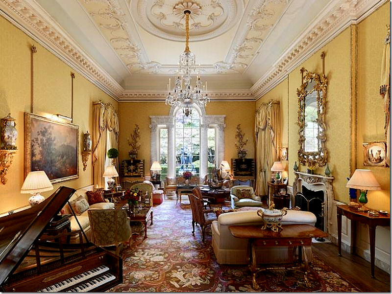
The grand living room. This looks like a royal townhouse in London. The living room and dining room are exactly the same size – Easton designed them using the perfect room ratio as set by Palladio.
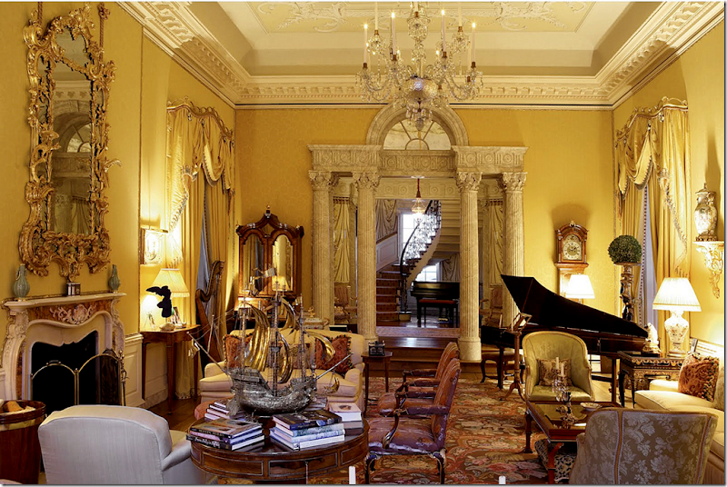
The view towards the other way overlooking the staircase. Whoa.
The dining room. Easton redecorated this room in the 1990s.
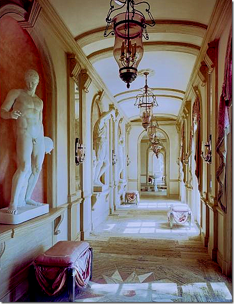
This is my favorite part of the house – is this Chatsworth??? This is the main hallway that leads off the front lobby.
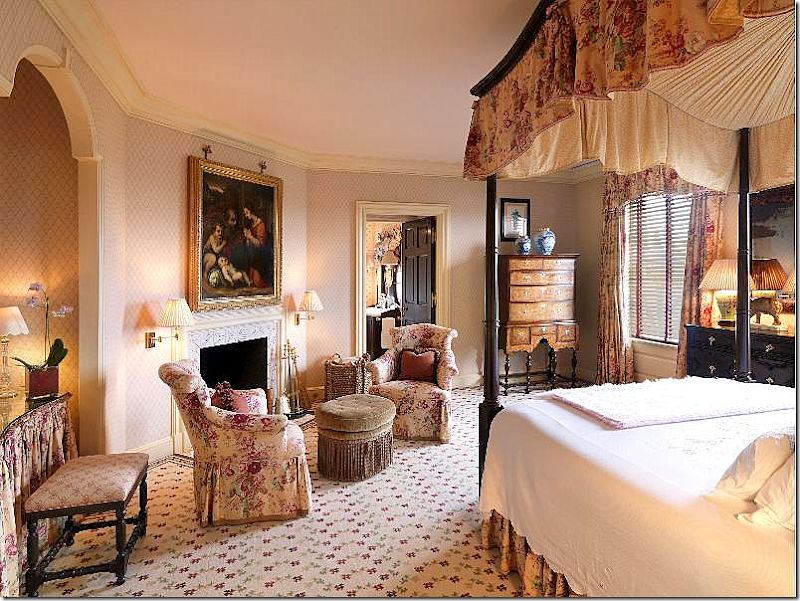
One of the bedrooms – probably a guest room. Very English, very proper. The chairs are so pretty! So is the vanity table.
The estate comes with its own chapel. You never have to leave home to go to church. I wonder do you hire a preacher full time???
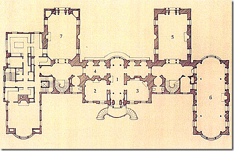
Floor plans to Albermarle House. At 23,000 sq. ft. the house is considered small for its kind.
ASPEN:
Shown in Architectural Digest – a newer project is located in Aspen. Notice the trademark center table with the benches surrounding it. A one room living/dining area – just like Balderbrae.
Another view of the grand living/dining room in Aspen.
The vignette in front of the large window in the family room/breakfast room. Notice the beautiful ceiling here.
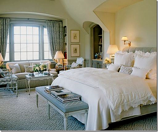
The Aspen house – master bedroom. Easton has such a perfect touch – nothing is ever “off” or “wrong” - each fabric choice, each furniture choice is always right.
DALLAS:
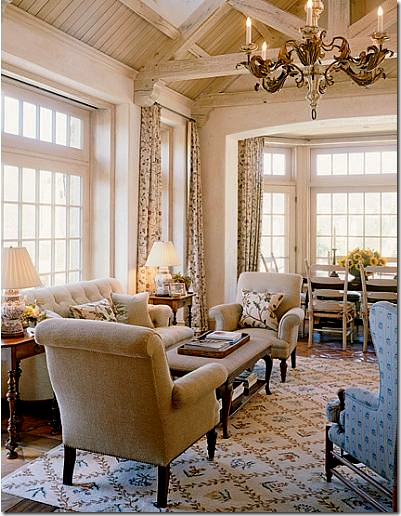
This living room in Dallas reminds me so much of Balderbrae. I assume the owners loved the Easton country house and used that as an inspiration. This is a more dressed up version of the living room in that house. Of course, there is a round central table.
Another view of the living room. Notice again the beautiful ceilings and the cubby above the doors – these are frequent design elements that Easton uses.
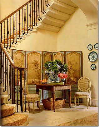
The beautiful staircase in Dallas – I love that screen and I love the table and chairs vignette with the French laundry basket below. So casual! Seagrass runner on the stairs.
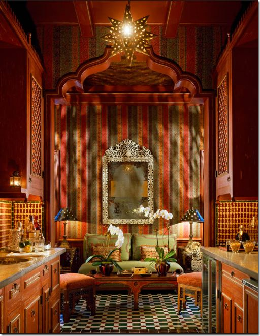
There is a Moroccan styled bar in the Dallas house. It truly looks so authentic!
Another view – of the bar in the Dallas house.
ETC:
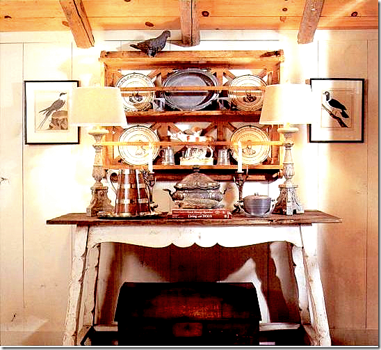
Interesting note: The interior designer Charles Faudree always uses Jimmy Steinmeyer to illustrate all his design books. The first I ever heard of Steinmeyer was through Faudree’s books. Here – in a picture of Faudree’s own breakfast room, are two bird prints out of series that came from the Balderbrae auction! I wonder what else Faudree bought at auction from Easton?
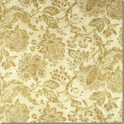
Besides designing houses and hotels, Easton also has a fabric line with Lee Jofa. His fabrics are wonderful, this is one of my favorites – it makes a wonderful curtain fabric, and it comes in many colorways.
Another favorite is this indoor/outdoor fabric by Easton. It comes in different colorways. I actually used the blue colorway in a pool house I designed about five years ago:
Here is a picture of the poolhouse room with the David Easton fabric I used on the windowseat. (Don’t look at the rug! This was only a loaner until the seagrass came a few days later!!!)
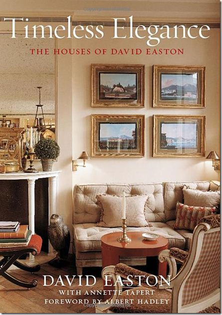
I hope you have enjoyed this look at David Easton’s Balderbrae, Then and Now. Many of the houses featured today are in his new book, which I highly recommend if you are a fan!!! To order from Amazon, simply click on the title below. And remember – watch for David Easton to be a guest soon on the Skirted Roundtable.
|


















No comments:
Post a Comment