Two new design books were recently released – both have strong Texas ties. Enjoy!
BOOK #1
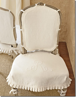
Slipped chair designed by Lauren Ross – a favorite of design bloggers.
Last year I wrote two stories about Lauren Ross’ houses – one in Houston and her newer one in Austin HERE and HERE. The response was overwhelmingly positive – so many readers were interested in seeing more of Lauren’s house after it was first featured in the magazine Country Living. Her style is all about white linen and seagrass and slipcovers and it seems that half of the design blogdom was obsessed with it: pictures of her slipcovers seen in Country Living have shown up time and time again on the internet. It was a thrill for me to get to know sweet Lauren and her houses – especially since the one in Houston is a long time favorite of mine. Earlier this year Lauren told me that her house was being photographed for Carolyn Westbrook’s latest book. I wasn’t surprised – Lauren and Carolyn have similar styles, both loving white linen. Carolyn, a designer, sells her own line of linens, bedding, slipcovers and duvets, along with antiques at Round Top and other fairs throughout the year. Just released, The French Inspired Home, is Carolyn’s second book and Lauren’s house is featured in it, along with Carolyn’s and several other Texas houses.
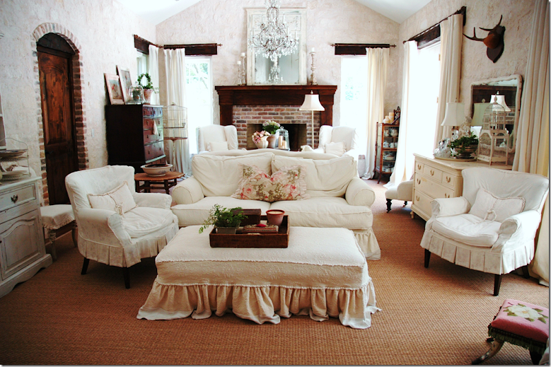
Lauren’s Great Room in Austin has two separate seating areas – both in white linen slipcovers. Lauren’s look and Carolyn’s look are similar - linen is the predominant fabric in both their houses.
Lauren’s family room has Austin limestone walls. They add so much personality to the house – the rough texture plays off all the soft linen.
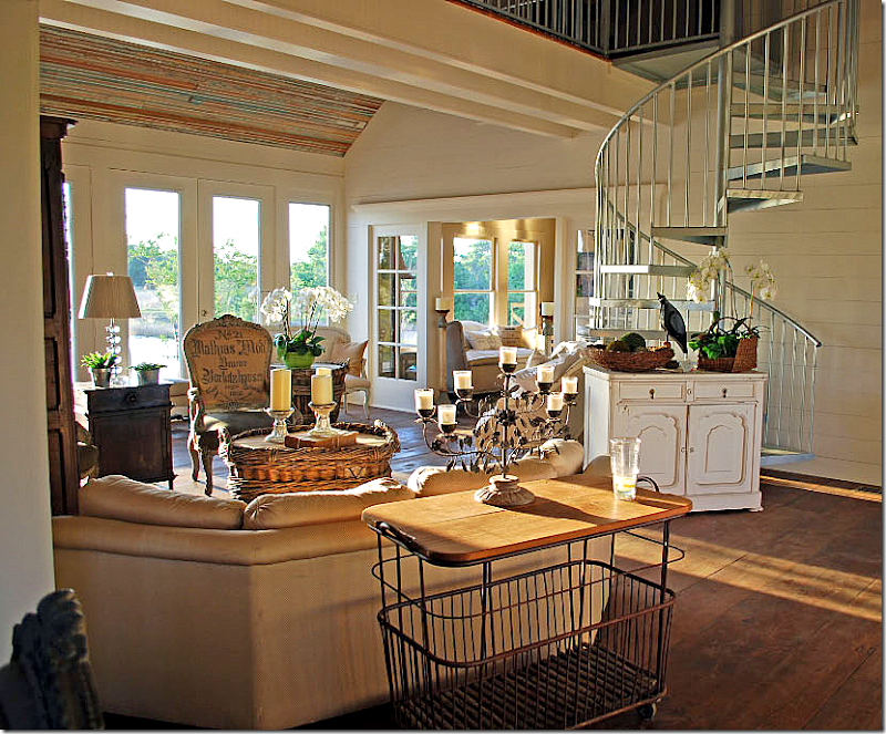
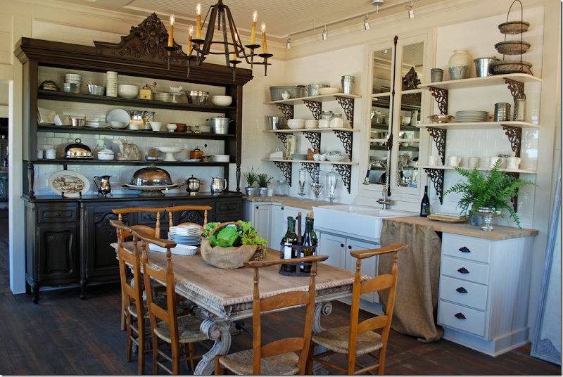
This house located in Round Top is also featured in The French Inspired Home. It looked familiar to me – and then I remembered it was first seen in the blog, Beadboard Upcountry HERE.
Its kitchen is really fabulous. There is also a La Cornue range on the opposite wall!! I wonder if the house ever sold?
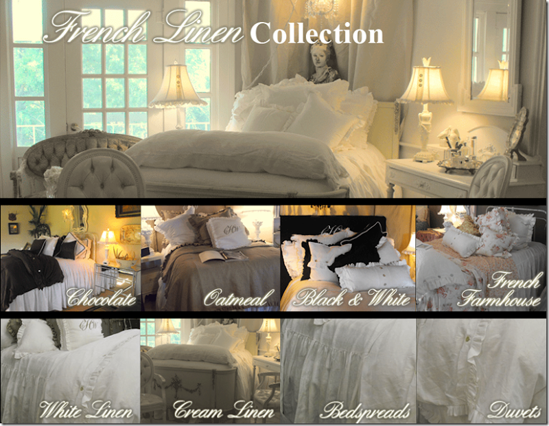 In case you aren’t from Texas and didn’t make it to this year’s Round Top, you can order linens from Carolyn’s line on her website HERE. I am partial to the chocolate line. So pretty!
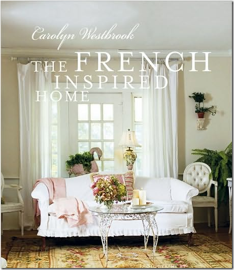 The book is now available through Amazon. If you like white linen, slipcovers and seagrass, I think you’ll like this one too!
BOOK #2
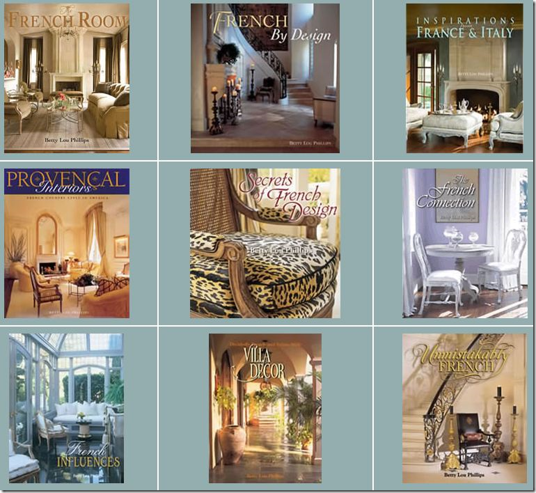
The second Texas design book comes from the prolific Betty Lou Phillips. Just released this week, French Impressions is her 10th design book – amazing! I remember her first one, published in 1998, like it was yesterday – there was a lot of buzz about it, everyone was talking about this designer from Dallas named Betty Lou Phillips. Since then, I’ve eagerly bought each subsequent book. Most of Betty Lou’s books are filled with interiors done by her along with a few select designers, including her two designing daughters-in-law. French Impressions is different though and it took me a while to realize that when reading it. It’s about one house only – hers. Over the years, Betty Lou has featured her own houses – from her French house in Highland Park to her getaway mansion in Colorado. In French Impressions she writes about her newest house just recently completed in Dallas. It doesn’t really explain this in the book anywhere, that I could find – but it’s not hard to figure out that all the pictures are from just one house (although it did take me a while to catch on!)
The beautiful Betty Lou Phillips has sold over 1/2 million books, including a series of children's books.
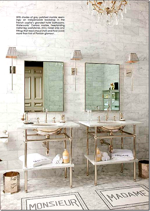
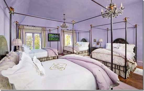
What is the house like? How to describe it? Imagine being an empty nester and building a house that could double for a hotel in Paris. This hotel theme runs throughout the enormous house which seems designed to luxuriously house numerous guests, including its owners. Every detail seems geared to guests. For example, consider the elevator. Usually when there is a residential elevator – it is hidden away. Not so here – a large sign in French announcing “Ascenseur” hangs above its doors – just as it probably once hung above an elevator in an old Parisian building. And to be sure, there is a 19th century Baccarat crystal chandelier in the elevator. Everything is excessive, from the marble and gilt powder room with two sinks to the kitchen, the offices, the granddaughters bedroom. Betty Lou has 4 granddaughters and they have their own suite – a sort of Parisian hotel dorm room. Each girl has her own Patina four poster bed designated by her monogram on the sheets. Then, there is a large attached bathroom filled with everything a preteen might need, along with a computer room, I-Pod and Wi-Fi ready. I think the granddaughters room is my favorite of them all – it’s utterly charming – a private hotel suite for the four girls whenever they visit Granny. The lone grandson has his own suite, jungle themed. Then, there’s Betty Lou’s husband who has a private country club, complete with a club room worthy of any CEO, and a dressing room with a putting green.
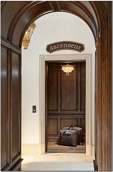 Rather than hidden away, the elevator is marked for guests to find.
No expense has been spared here. There is more white marble in this house than in Italy - the kitchen and bathrooms are floor to ceiling marble. Next to the large kitchen with its gleaming La Cornue range, is the marbled “catering” kitchen – larger than most main kitchens. The catering kitchen has to make-do with a just a 36” Viking range. The enormous dining room is set up like a hotel – instead of just one large dining table, there are three Fortuny skirted round tables, each with its own crystal chandelier. Most interesting is how much furniture Betty Lou used from the old house. Her living room and dining room are furnished almost identically to her former abode. Betty Lou truly loves French furniture, especially armoires – almost every room has one fabulously tall antique armoire in it. Yet, despite the numerous armoires, much of the furniture appears new rather than antique. The family room is notable for its walk-in bar set up with white clothed tables and banquette seating, just like you would find in a French hotel. In fact the paneled bar was copied from one found in Paris’ Le Meurice hotel. The library is drool worthy – floor to ceiling bookcases cover each wall and hiding behind a movable shelf is the filing room – just perfect to stash away those messy papers and folders. The laundry room - OY. It’s decorated in pink patent leather wallpaper with shelves holding monogrammed baskets for each bedroom and bathroom. There are only two chandeliers in the laundry room. There is even a mailroom – and it IS a room –wallpapered in a Eifel Tower theme.
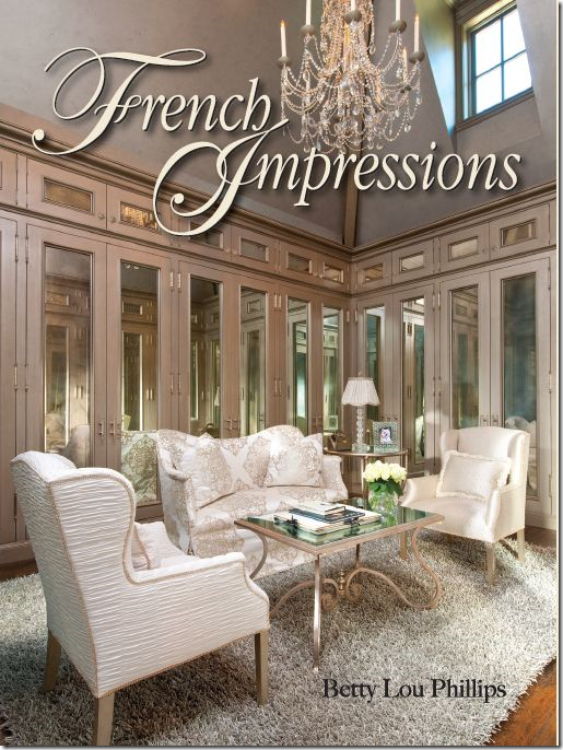
The attention to the smallest detail is remarkable. The pantry looks like a stage set – all the perfectly organized cubbies are labeled, in French AND English: Pates/Pasta, or my favorite – Sauce Tomate/Ketchup. Each bathroom has its own set of specially monogrammed towels. Napkins are monogrammed “Cafe Le Bastille.” There are even bags holding newspapers that hang on guest bedroom doors proclaiming “Good Morning” – just like any five star hotel would provide. Betty Lou’s dressing room is on the cover of the book – antique mirrored closet doors ring the two story room which is large enough for a sitting area in the middle of it. Outside there are more guest accommodations, a lilac colored working office fit for Marie Antoinette, and a backyard resort area with pool and cabana.
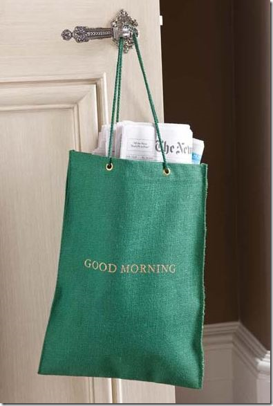 Guests receive the morning papers just like at a hotel. I wonder who actually gets up in the morning to deliver these papers?
Do I like the house? I have to say I miss the Bennison fabrics and decor from her warm and inviting Colorado house. This house is very dressy, not anything like my preferred, laid back, comfy style. But the house is definitely worth seeing and reading about, if only to get a glimpse at how one can happily live in a Five-Star Parisian hotel smack in the middle of Dallas, Texas.
Pictured on the cover is Betty Lou’s two story closet. Yes – this is her closet.
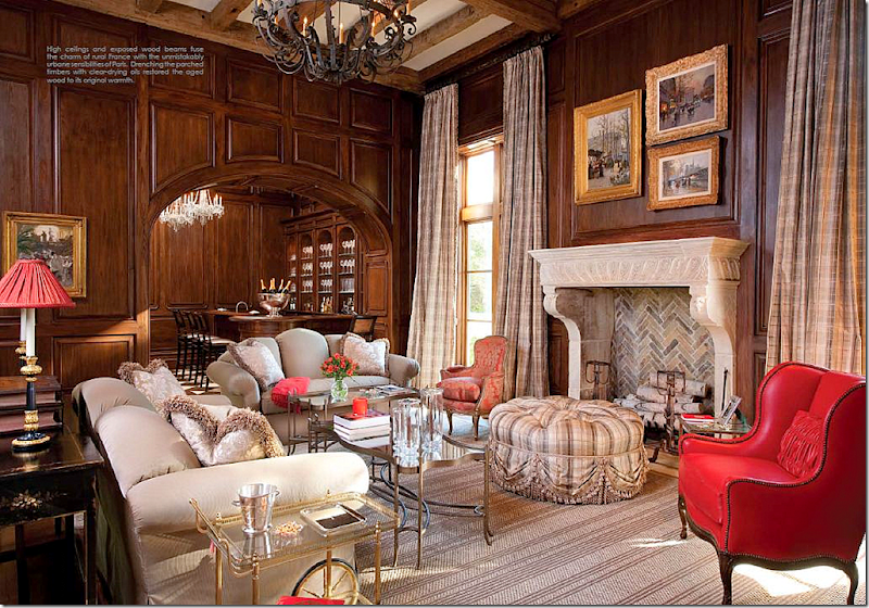 The family room with its paneled walls has a large 16th century fireplace. The hotel style walk-in bar is on the left.
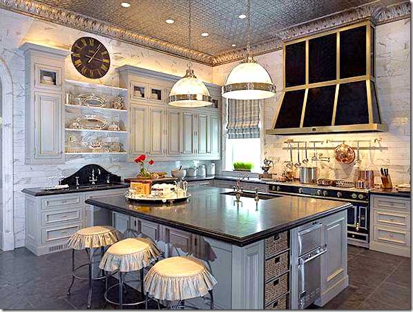
The kitchen has soapstone counters and white marble walls that extend up to the ceiling. I love the soapstone backsplash behind the sink. Be sure to notice the ceiling. Next to the kitchen is the large catering kitchen.
A view of the La Cornue range – this French range can cost more than the average house!! What a dream to own one. Would you rather own an English AGA or the French La Cornue? Hmmm. That’s a tough one to answer.
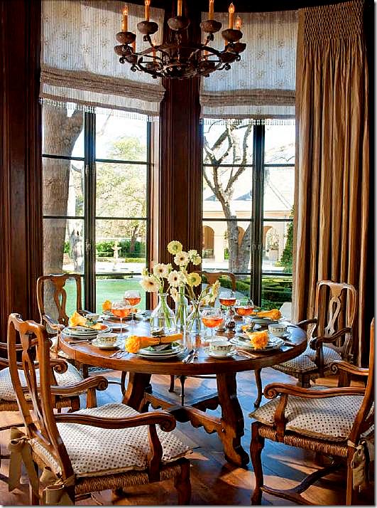
The breakfast room, with its Michael Taylor furniture, has steel windows and walnut paneling. Betty Lou has written a chapter on French table manners, including how to properly eat lettuce.
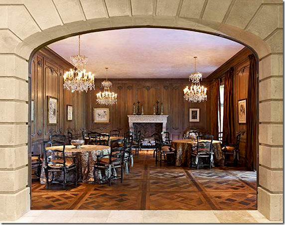 Looking into the paneled dining room with the skirted tables.
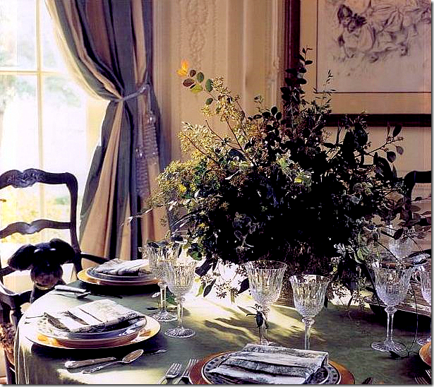
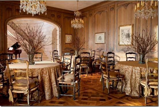 The view towards the stairhall. Notice how each table has its own chandelier. These chairs are the same ones used in her former house – just the cushions have changed.
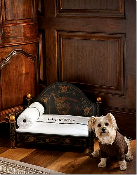 The adorable Jackson in his Ralph Lauren sweater has his own Patina bed with monogrammed linens. Patina is a favorite line of Betty Lou. Apparently Jackson has beds like this all over the house, but prefers to sleep with his mommmy and daddy – naturally!
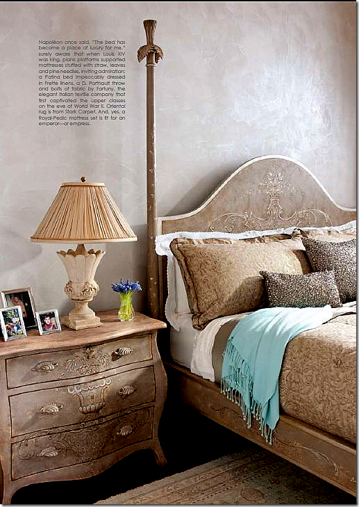
The master bedroom with its Patina bed is part of a large suite – consisting of huge his and hers bathrooms and closets.
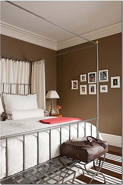
One of the guest rooms with dark chocolate walls.
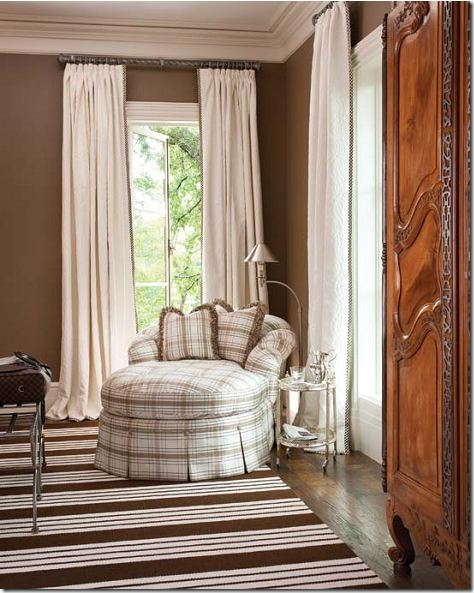 Almost every room has a large antique armoire – as seen in the guest room.
The guest room’s bath – the bath mats are actually tiles. Notice the monogrammed towels match the bath mats. As always, there is a crystal chandelier or two in this room.
The granddaughters dorm room – 4 Patina beds with individual monogrammed sheets. A computer room for the girls is part of the suite.
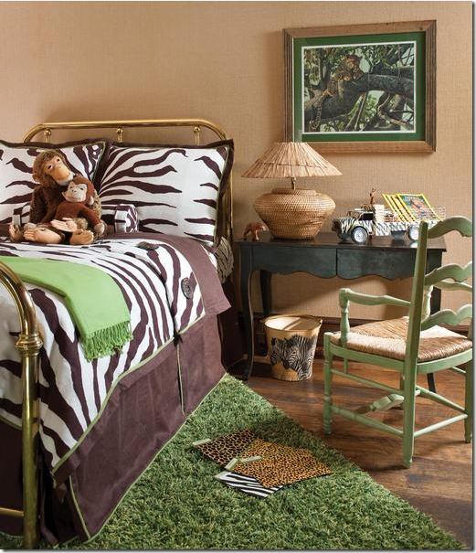
The grandson has a safari themed room.
In the pink vinyl wallpapered laundry, each room has its own basket. Bed sheets are pressed here.
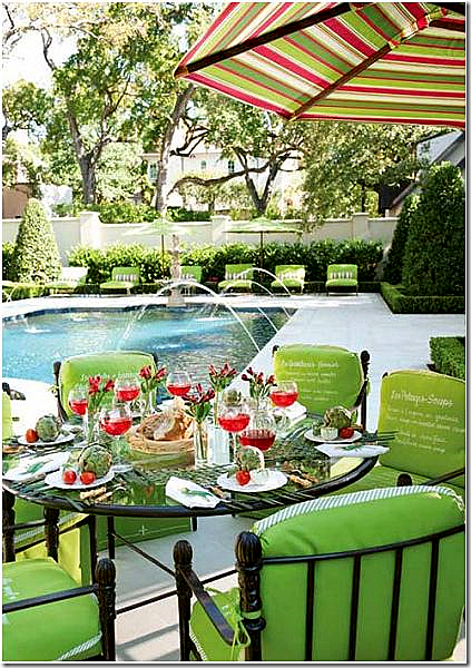
The back yard is a resort – with a fully stocked cabana and pool. All the furniture has bright colored cushions. Menu items in both French and English are monogrammed on the chair back cushions.
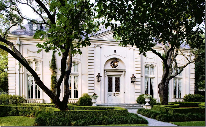 A look back: this is the house Betty Lou featured in her first book – Provencal Interiors. She sold it last year when she moved into her new house, the subject of her latest book.
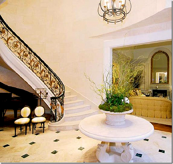
The old house: The marble floored entry hall – the piano and the two small French chairs are also in the new house’s entry hall – but with fresh upholstery.

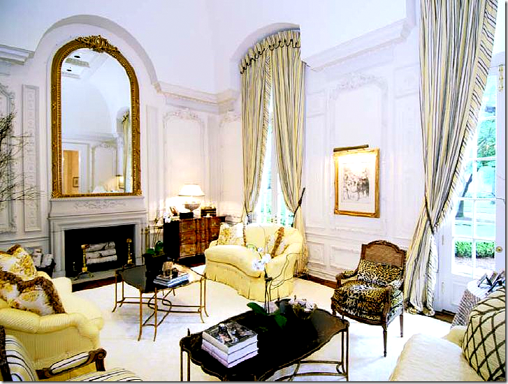
In the old house – the living room and dining room were mirror images. Here the paneling is painted, while in the new house, the paneling is stained dark. Do you prefer the light paneling or the dark?
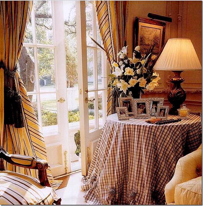
In the old house, a vignette in the living room.
This 1760 French commode is one of Betty Lou’s prized antiques. Seen in the living room in both her old house and the new one.
The old house’s dining room is set up exactly like the new house – just with different fabrics.
A vignette in her former dining room with the blue and white striped fabric and a beloved pet.
The family room – designed for the 90s. Betty Lou really liked to use skirted tables. It seems every room in the old house had one.
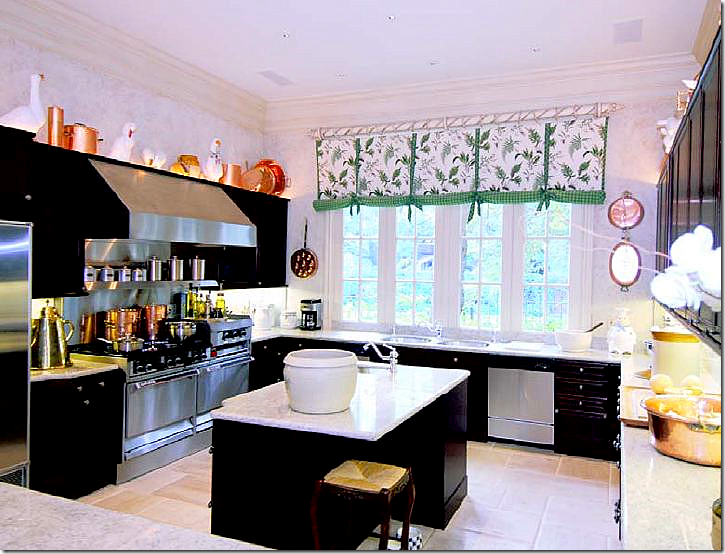 The old house’s kitchen is not nearly as luxurious as the new house, but it is still amazing.
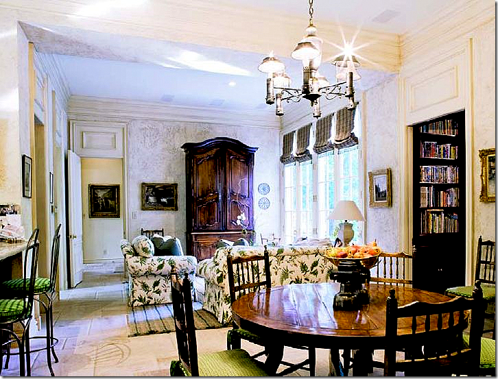 The breakfast room in the old house – notice the gorgeous buffet a deux.
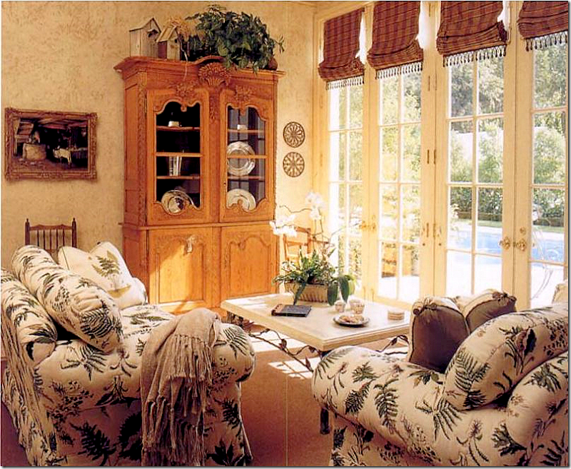 An earlier picture from the 90s shows a pine cabinet instead of the buffet a deux, plus the rug was plain here. I like the newer version with the French buffet more.
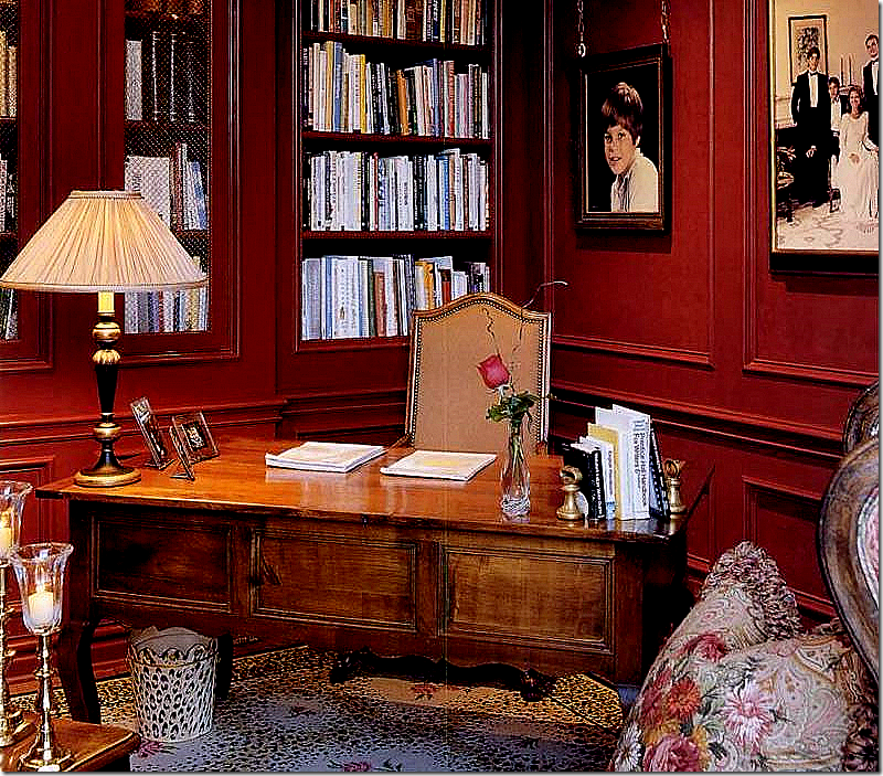 The old house’s library. Notice the carpet that popular in the late 90s. This desk in now in the brown guest room.

 The grandson’s safari bedroom in the former house.
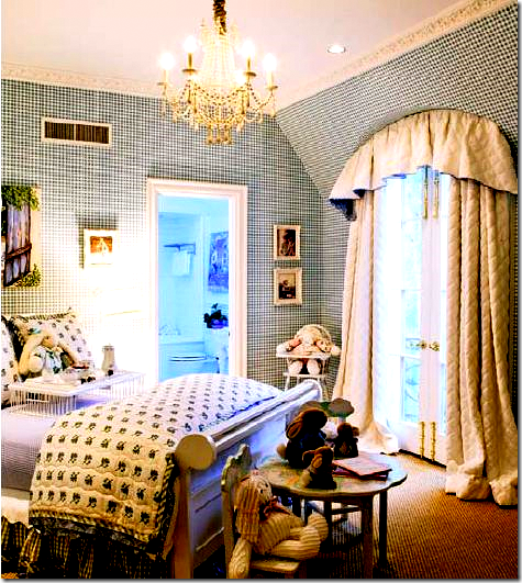 An earlier version of the granddaughters' bedroom.
To order these two books, simply click here through to Amazon!
| The French Inspired Home : click here to order this book from Amazon now! |
| French Impressions : click here to order this book from Amazon now! |






No comments:
Post a Comment