Along with all the emails I get, some come with questions about decorating: people write in needing an opinion about a paint color or furniture arrangement or slipcover advice. Many emails come with photographs to illustrate the problem which always makes it much easier to give an intelligent response. Sometimes I get emails that proudly show off the “afters” – what the reader did to her house to make it look just a little bit more stylish. Sometimes I get emails from readers who send in pictures because one of their rooms reminds them of an interior I put up on the blog, or better yet, they have the famous white slipcover Ikea sofa. I absolutely love all the pictures readers send me, it’s one of the more fun parts of being a blogger - looking at all your houses and seeing how you decorate them. Today is the third installment of Readers Houses and I hope to continue to do this once a month. I encourage all of you who want to share your house, or your favorite room, or your garden to send in pictures to my email address. Here are the most recent Readers Houses I’ve gotten. I hope you enjoy these, and I hope they give you some ideas to try out in your own house!!!
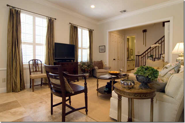
The living room – newly installed stone floors and silk curtains dramatically dressed up this townhouse.
The first reader lived in this beautiful townhouse in west Houston. Since she and her husband were restoring an older house in a very small town between Houston and Austin – the townhouse was up for sale. The move was bittersweet because they had completely remodeled the townhouse and truly loved it, but life in a small town was calling them. The townhouse recently sold and they are now getting settled into their newly restored house. Hopefully, they will send in pictures of that house too!
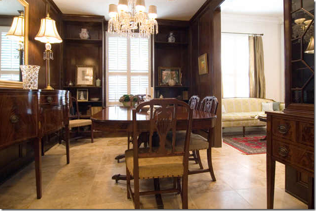
The traditionally styled dining room was painted a deep brown. I love how the light stone floors contrast with the dark walls.
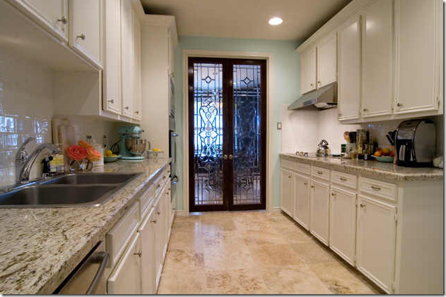
The homeowners added leaded glass doors between the dining room and kitchen.
Here you can see the leaded doors – aren’t they gorgeous? What a great idea to turn a typical doorway into something truly special. The kitchen was updated with granite countertops, stone floors, and new appliances.
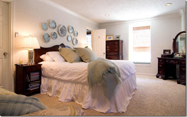
Upstairs, antique furniture is dressed in all white linens which makes the furniture seem less “serious.” I love the plates on the wall. I can’t wait to see their newly restored house!
Before: A typical rarely used dining room.
This reader lives in a west Houston suburb. She had a large dining room which was mostly unused, something she was desperate to transform into “girl retreat” – a hideaway from her twin sons and sports loving husband (boy, can I relate to that husband!) She first contacted me to ask how she might sell her dining room furniture, something I really couldn’t help her with except to mention Craig’s List – which seems to be the best thing going these days to unload unwanted furniture. A few months after sending me the photos of the “before” dining room, the reader sent in these pictures of her newly created “girl retreat:”
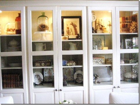
The reader changed the room from green to cream, sold her dining room furniture and bought three cabinets from Ikea’s Liatorp collection. She added the lighting inside. The white slipcovered chairs are from the famous Ektorp line at Ikea that I am always talking about. The curtains (which she accidently shrunk, and is currently replacing) come from Ikea too.
A close up of her styling. The lights really add a lot to these Ikea cabinets.
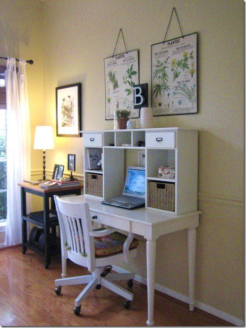
The desk and chair are from Pottery Barn via Craig’s List, and the antique botanicals above it came from Urban Market (which is this Sunday in Houston, btw!) The printer stand has not yet been painted.
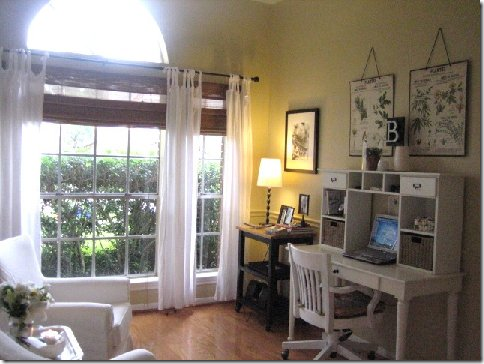
Curtains and shades, all white furniture, creamy paint, and 3 white cabinets from Ikea transformed a rarely used traditional dining room into a retreat for the homeowner. Great job!
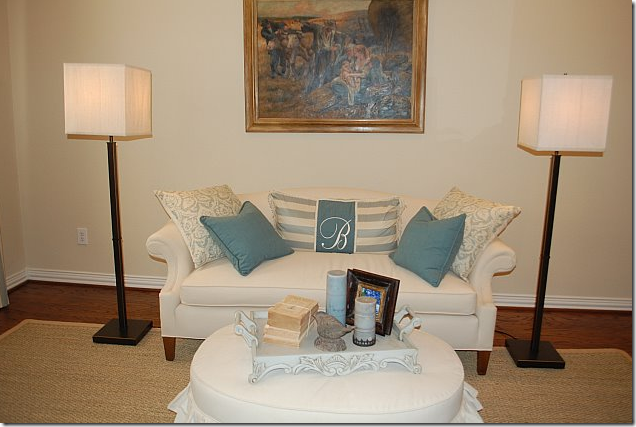
When I showed pictures of a job I had just completed for a client – The Tanglewood House – the ottoman/coffee table elicited a lot of comments. This reader took it a step further:
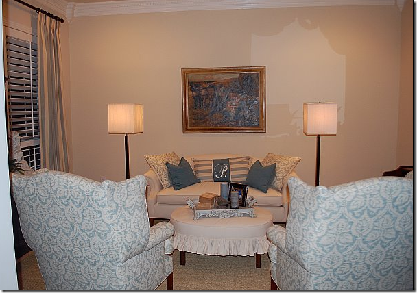
This reader’s email pictures really thrilled me! I love how she made her own table into an ottoman – just like I did in the Tanglewood House.
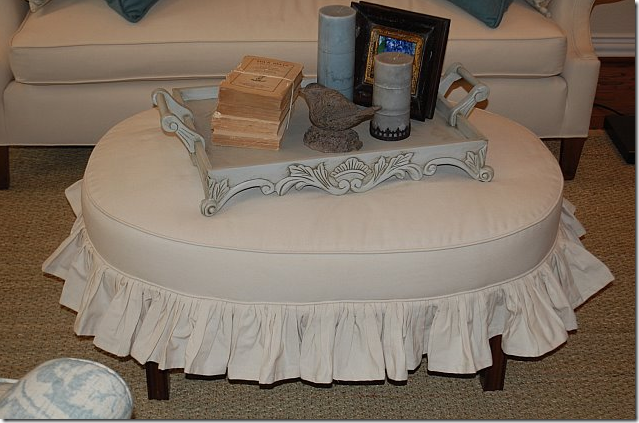
A close up of the newly reconstructed table. Isn’t it adorable?!!! The ottoman started out as a wooden butler’s tray table. Now, it is a youthful looking and useful piece of furniture.
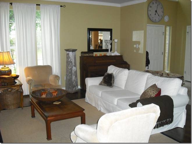
I love all the elements in the rooms – the white linen furniture, the blue and white fabrics, the striped curtains, the seagrass. And I love the standing lamps that set it all off.
The reader used blue and cream striped fabric at the window and a great damask on the chairs. I spied some very similar fabric at the local Calico Corners. I love the clock too – a great placement. All in all – a wonderful redo!!!
This reader is actually the owner of the Tanglewood House. The pictures are of her sister in law’s house in Austin, Texas. She knew I would love it with all the seagrass and white slipcovered sofas.
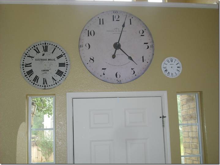 I love the trio of clock faces above the front door. What a cute idea!
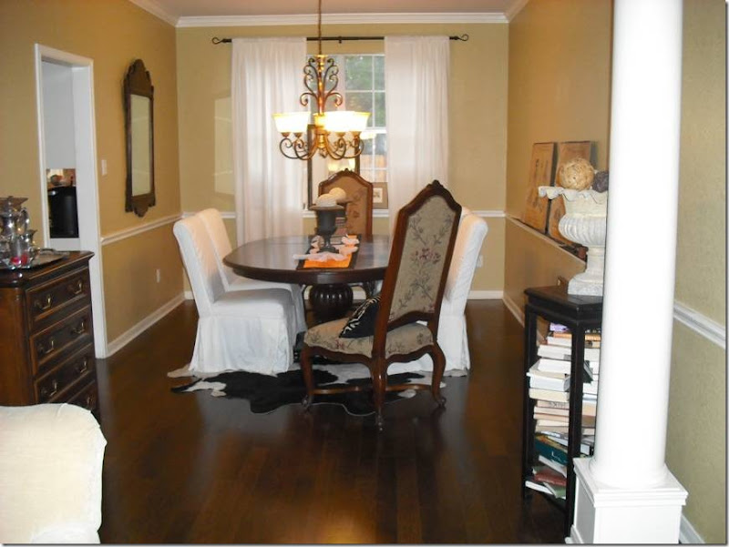
In the dining room, she used white slipcover chairs and fancier host chairs. A large black and white cowhide is under the table.
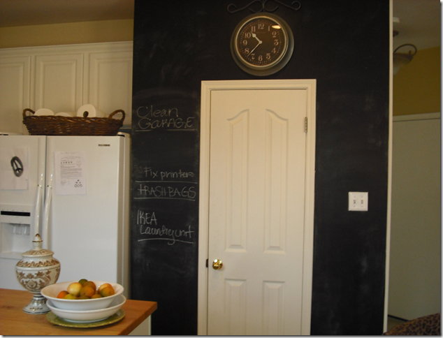
The kitchen is really cute – especially with the painted on chalkboard that surrounds the pantry. And I love the clock above the door.
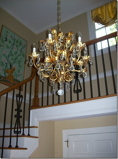
This reader sent in pictures of her house when she had a few questions about redoing her study. But judging by these pictures, I’m not sure she really needs my help at all! The entry hall’s staircase is a classic with the chandelier and iron balustrades. I really like the art work here.

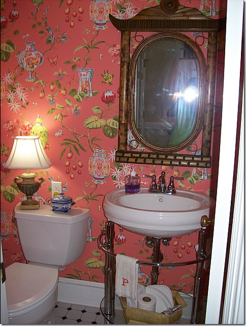
The chinoiserie inspired powder room is great with its beautiful coral wallpaper. I love the pedestal sink too. But I really love lamps in bathrooms and kitchens – it helps cozy up the area.
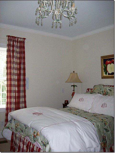
My favorite room in the house is the guest room with the darling check and chintz fabrics. I’m a sucker for a checked fabric. I love the red monogramming that picks up the red checked fabric. Too cute.
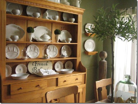
This reader from California changes her decor with the seasons. In the summer she uses blue and white plates in her green and white striped breakfast room. The wallpaper is so fresh and crisp and looks so great against the blue and white.
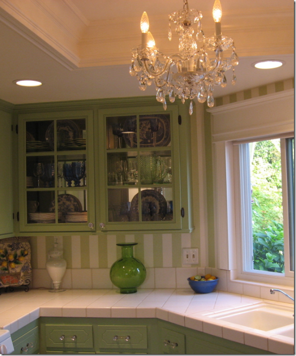
The kitchen cabinets get changed out with the seasons too – here are her summer blue and white dishes. Love the chandelier!
In the fall – she uses white tablecloths and an assortment of gourds to decorate, along with seasonal dishes. Notice how she placed mirrors besides the window to expand the unit – the matching lamps and pedestals add necessary weight.
Her fall plates.
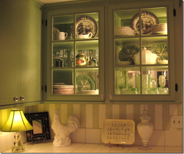
This last Thanksgiving she used the black and white transferware plates along with a vegetable laden centerpiece.
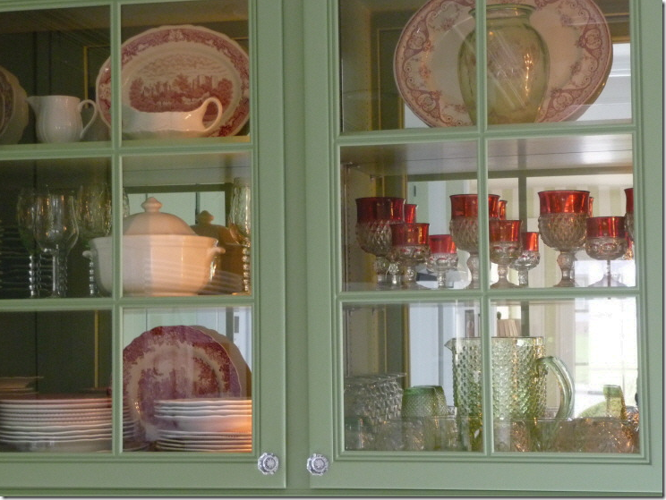
The spring plates – red and white.
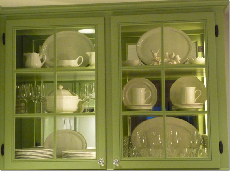
The all white look.
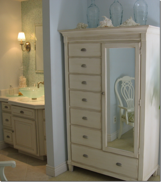
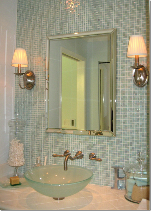
The reader lives by the coast in California – so she wanted a beachy feel in her master suite.
A peek into her master bathroom.
The vanity area – I love the mosaic tiles and the wall hung faucets. So beautiful!
I hope you have enjoyed this latest installment of Readers Houses! I plan to continue to show your homes once a month – if you send them in. Don’t be shy!








No comments:
Post a Comment