 When ever I think about my current design aesthetic, where it came from, who influenced it - several people come to mind. Of course, there’s the famous Betty Rae, my mother, who introduced me to country French furniture and antiques, and everything in between that is timeless and stylish. Another influential person would have to be Carol Glasser, a Houston interior designer – whom, unlike my mother – I’ve never met before. Glasser is a well known name in Houston; she has had much regional exposure with numerous stories in Veranda, local magazines, and Southern Accents. There’s even been national press along the way - a House Beautiful cover, a Country Home cover, and numerous mentions in books by her great friends Mary Emmerling and Katrin Cargill. And all the press is well deserved: Glasser possesses a huge sense of style; along with an keen ability to edit, she also shares a great charisma and a classic beauty. A true Southern woman with quite a flair for living a gracious life, she ranks up there with two other famous Southerners - Charlotte Moss and Suzanne Rheinstein – in fact, she can hold her own with anyone in the business, no doubt. She is a style setter with an excellent eye for just that one right piece; owners of antique stores cull her favor. Her taste level rivals anyone on any current Top 100 list. You think I exaggerate?
For year Glasser and her husband lived in this one perfect house – small by River Oaks’s standards where the neighbors might just be on the International Best Dressed list. But it is the size that made the house so perfect. Each room was cozy, designed for human proportions – no vast master suite with acres of wall to wall carpeting and empty spaces to fill up with tacky furniture. The house was built in the 30s, and though its facade is Georgian, it possessed a few elements that set it apart and attracted Glasser to it in the first place: one was the staircase with its iron railing that slightly wound around the back of the living room. The house was not ostentatious, and anyone who knows Carol’s style would know she would never live like that. She likes a house to be well lived in, each room is to be enjoyed, comfortable, inviting, and with layers of collections acquired over a lifetime scattered about. She likes muted, patinaed surfaces, rubbed leathers and slightly peeling paints. But make no mistake, there is no Shabby Chic here at all. There is nothing trendy about Glasser, instead everything is classic. In fact, the ghost of Nancy Lancaster looms around each corner: for years the walls of the living room were Nancy’s fabulous shade of butta yellow. And yes, Glasser credits her youthful travels to England and her first exposure to Lancaster and Colefax and Fowler as a major influence. Later travels to France and India influenced her too and in different ways. She loves color – though the precise shades have evolved through the years – a love of red softened into apricot, blues turned into teals, yellows mellowed into a cream. And her penchant for dark wo0d furniture and pine is now tempered with a love of muted gray, painted finishes.
I look around my house and see Glasser’s influence in so many things, like blue and white transferware. Carol’s huge, 10 ft long Welsh dresser with her famous collection of the blue and white plates sparked my own collection, along with my sister’s, and probably half the women in Houston. And there is the seagrass rugs and the wall-to-wall seagrass, decades ago before anyone in Houston even heard of it. There is Bennison, that beautiful, hand-blocked linen, muted with the look of tobacco stains – her entire bedroom was covered in Bennison’s Roses and it remains one of my favorite fabrics to this day. There are so many things that Glasser had before anyone else here did; things that are still fresh today, though she has decorated this way for over twenty-five years now. She loved antique paisley – fabrics and throws - and her pillows were made of scraps of the finest Flemish tapestries, always. Her kitchen had ironstone that said “Butter” and “Real Butter” – before it became so popular it was mass produced. Her collection of putti rivaled the pope’s, along with the gilt candlesticks from Italy and the chandeliers that were never electrified. Her living room had a blue and white striped dhurri rug – eons before Something’s Gotta Give was released. Her dining room became a warm, red library and antique rattan replaced stuffy chairs. There were slipcovers on soft, cushy, George Smith furniture with English saddle arms and authentic proportions. Do you need more proof of her chicness? Each room had a hint of black lacquer or chinoiserie somewhere. Kenneth Turner wicker basket candles were massed everywhere. When art was too expensive, she bought antique mirrors, along with tortoiseshell boxes and crystal match strikers, and Santos, and delft, and down – everywhere there was soft, down comfort. Her perfect house was inviting: the kitchen was added on to create a sitting room with imported terra cotta tiles from Provence and beams for the ceiling. Her keywords are: cozy and warm and comfort and romance – flowers were everywhere and masses of fruit were piled high in French confit bowls – before they, too, were trendy, of course. She decanted before decanting was hip.
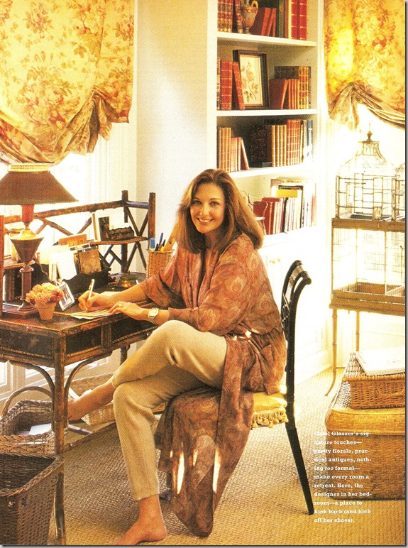
The beautiful Carol Glasser, in her Perfect House’s bedroom – wrapped in her paisley and surrounded by Bennison and bamboo. 1993.
The perfect house was published in the eagerly awaited, first issue of Mary Emmerling’s now defunct magazine. I still have that copy, worn and used. A year after that, the house was in a Houston magazine. And then in Veranda two or three times. Another house, one that she and Emmerling collaborated on and lived in together for a short while in Santa Fe was treated to an entire book about the process, written, of course, by Mary. Each time it was published, the house had changed, been tweeked a little, sometimes a lot. And each new viewing of her house was studied for the details: what was different, what was gone, what was new? Sometimes a real treat arrived in the mail when a client’s house was published! A friend of mine’s house was done by Carol three times, and twice it made the cover of a national magazine. Another house she did in Memorial – a gorgeous home – was immortalized to great acclaim. But, mostly her clients prefer their anonymity and what a shame it is not to be able to see the beauty! There’s no web site, no google hits, it’s all elusive and that’s part of the mystique of Carol Glasser.
Her back yard, an antique plant stand filled with romantic roses.
After over 15 years in the perfect house, Glasser began to change it and drastically. All the reds in the living room were gone, replaced by peaches and creams; the yellow walls were plastered ivory with a hint of apricot. The new decor was featured in two books: Emmerling’s Romantic Country and Peter Vitale’s The Divine Home. Each book had a few pictures of the new peach interiors – but not enough for this fanatic! It was torture not to be able to see more of the new direction Glasser had taken her house in, after having followed it for so long. And so, that was the end of the Perfect House. Soon after the remodeling, the house was sold, and she moved on, to a much needed (her family had grown) somewhat larger house, on a secluded cul-de-sac which I’ve stalked too many times to count. What does it look like – her new house? I know there are painted white Louis XVI style dining chairs with seafoam, Chelsea Edition check fabric. You can see those in the front window. I know, I know - arrest me! My sister-in-law attended a function at the Glasser’s new home a few months ago and called me as she left, raving and oohing & ahhing, knowing all the while she was torturing me. I’m sure the big reveal of her new interiors will be coming out soon in Southern Accents (Karen, please hurry already!) or Veranda or House Beautiful. Hopefully. I need a new Carol fix, and soon!!!!
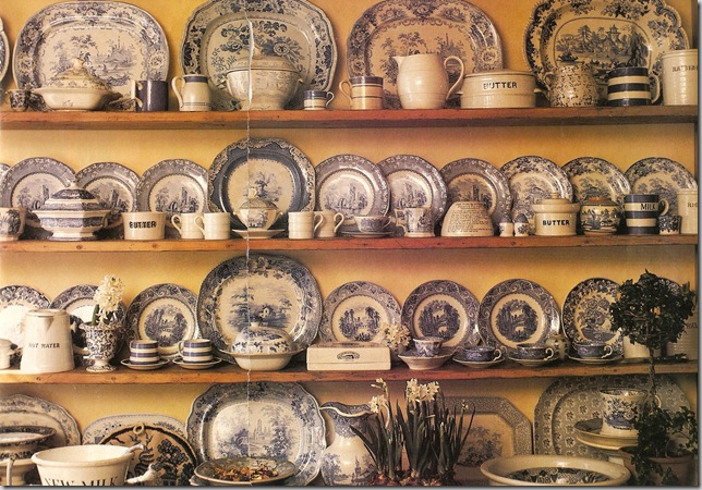
A portion of the famous Glasser blue and white transferware collection.
The perfect house is gone – sold, gutted, and redesigned by a new lucky owner. And yet, there it was one day, for sale again. The pictures of the new owner’s interpretation of the Perfect House were on HAR for one final look. And what a shock! What a surprise! If you hadn’t studied the house intently for two decades, you would never have recognized it was the Perfect House. But, it was. Still beautiful, still perfect, just different – oh SO different. So enjoy!!!!
Evolution of the living room:
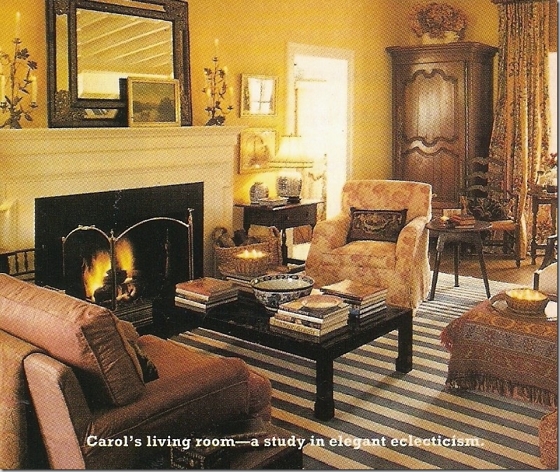
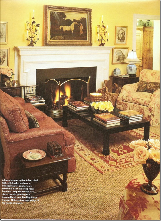
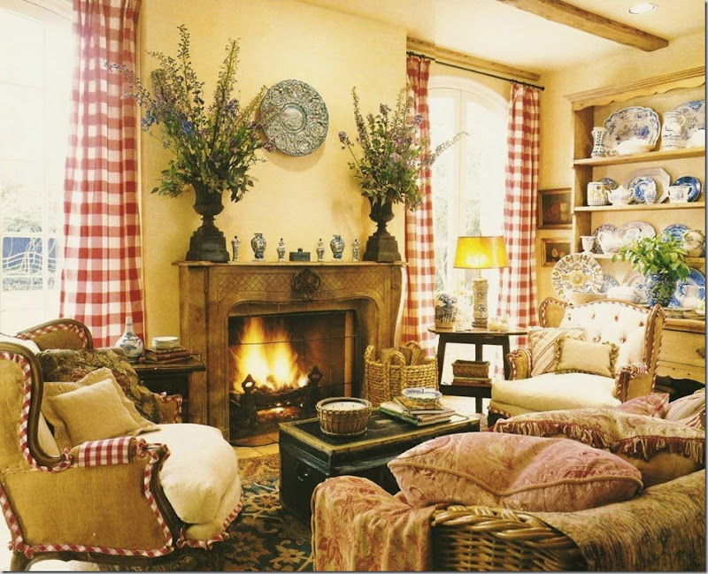
The first shot of the living room in 1993 featured the blue and white striped dhurri rugs, the yellow walls, black lacquered coffee table, and paisleys. Is this Houston or England?
1994: The dhurri has been replaced by seagrass and a smaller area rug. The mirror becomes a painting. But everything else remains the same.
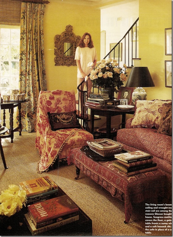
1994: The other side of the living room: a large piece of an antique toile remnant covers the chair, the pillows are antique tapestries. Notice the curtain treatment – taken to the ceiling, with shades – perfection! The charming, winding stairway was a selling point for Glasser.
The gateleg table in front of the window – filled with delft, santos, and candlesticks.
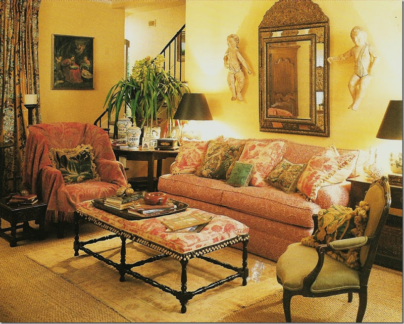
2000 in Veranda: A main change this time is the toile textile was upholstered into a new coffee table. Additional pillows were made from the remaining pieces. Putti and mirrors appear behind the sofa. Chairs are switched out. A new, antique oushak is added to this vignette.
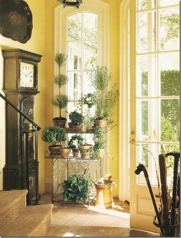
In the back yard, a small entry way leads to the staircase, carpeted in seagrass. Black chinoiserie tall clock, tole tray, and antique wire plant stand add to the romance which abounds everywhere – even in the back doorway!!!
The Dining Room/Library:
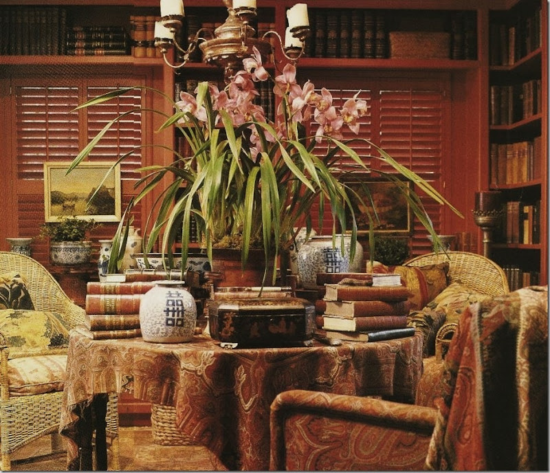
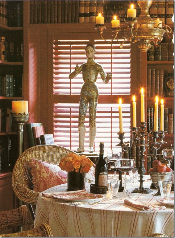
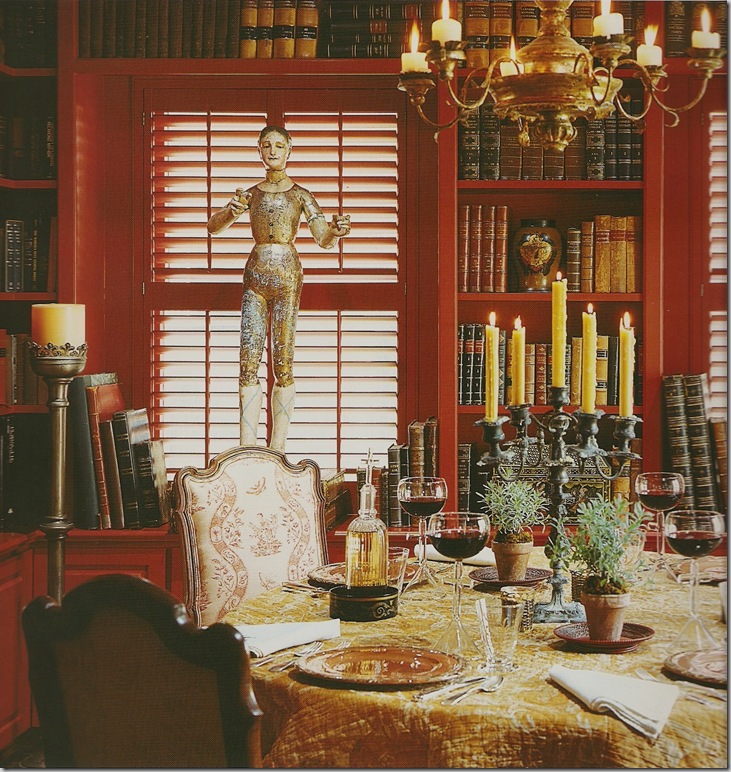
Through the years, the dining room remains about the same – only styled differently for shoots. Basically a library, painted red, with shutters. The main gateleg table is always piled high with flowers, books and porcelains. Here the wicker chairs with their antique tapestry pillows share the space with red paisleys and a chair upholstered in the paisley fabric.
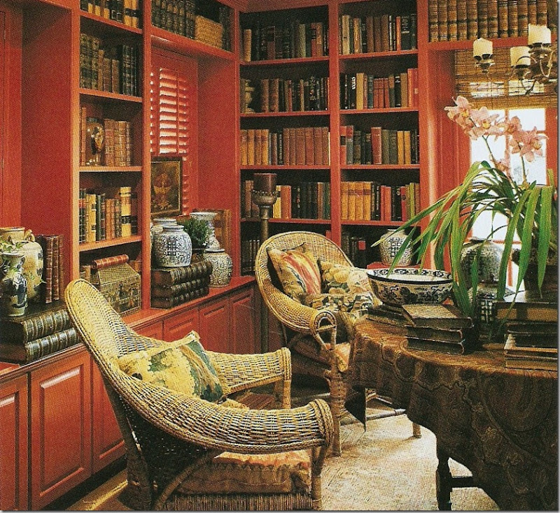
Another shot of the library, showing the left side of the room – a mirror image. Here you can see the thread bare, worn Oushak – aged to perfection!
The Family Room/Breakfast/Kitchen:
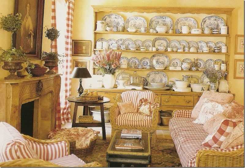
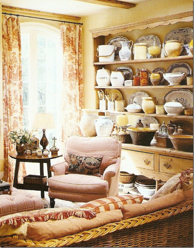
An early version of the family room which adjoins the kitchen and breakfast room. The furniture is all toiles and check. But the showstopper is the 10 ft long pine Welsh dresser filled with a gorgeous collection of blue and white transferware mixed in with white ironstone. This collection was an inspiration for many who saw it – me included!
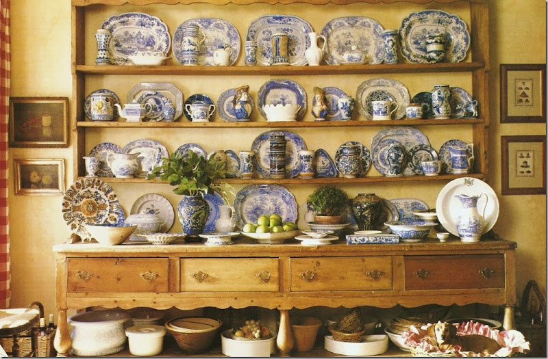
A close up of the antique pine dresser, styled differently. Throughout the years and the shoots, the arrangement slightly changed. It was never only blue and white transferware again, as in the previous picture. Notice the little dog in her upholstered basket bed.
For the 2000 Veranda shoot, Glasser made a lot of styling changes (which caused a lot of discussion among readers!) French chairs with muslin and tacked on trim were used for the shoot only. As were the urns and the mantel change. When the magazine came out, I remember not liking these chairs, but over the years – I’ve come to completely change my opinion and think they are just darling!!!
And still even later – the check drapes were changed to toile. The dresser has even less blue and white transferware remaining. Should I get rid of mine too????
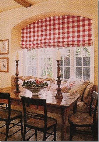
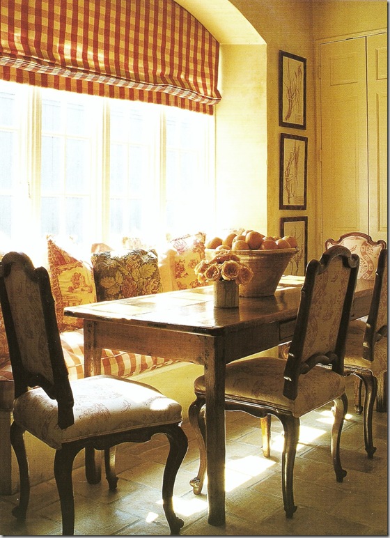
The breakfast room with its Colefax and Fowler chintz pillows on the window seat and check fabric slipcovers on the Hitchcock chairs. The arched window follows the arches found throughout the house.
The breakfast room without the slipcovers.
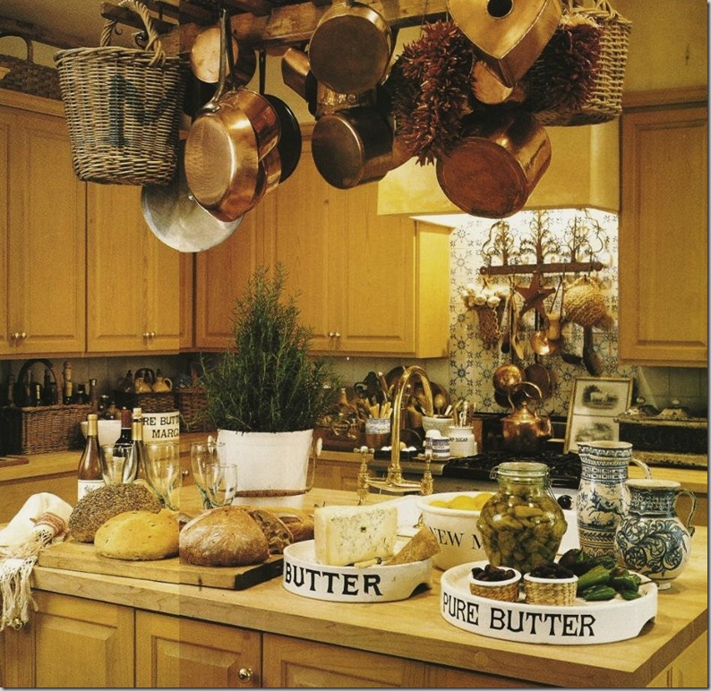
The kitchen, adjacent to the breakfast area and sitting area, is always styled with copper pots, white ironstone, wicker baskets and faience.
The Master Bedroom:
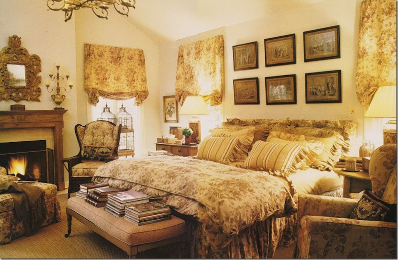
The bedroom is a vision in Bennison’s Roses. Glasser kept the room much the same throughout her years here. Why mess with perfection? Only the bench and the side chair on the right aren’t covered in Roses. This room is pure Glasser – warm, comfortable, inviting, cozy. This room could just as well be in the countryside of England, as in the middle of Houston!
The New Look. After about 15 years, big changes in the Perfect House started to happen:
A vignette from the new look with the lighter walls.
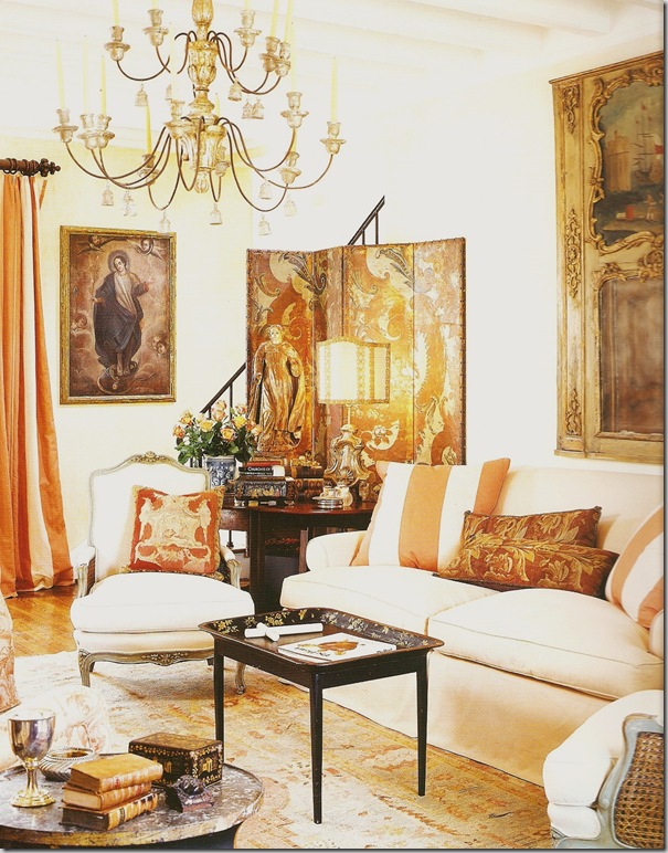
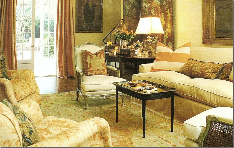
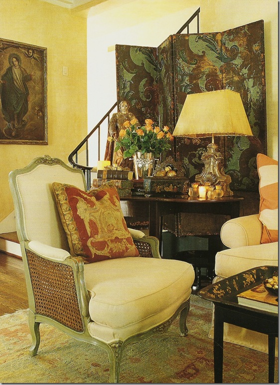
The living room: all the red and paisley is long gone. The yellow walls have been replastered in cream with a hint of apricot. A leather screen sits behind the cream colored sofa. The curtains and pillows are a peach and cream silk stripe. Painted French chairs flank the sofa. A French trumeau sits over the sofa and a stunning antique Italian chandelier hangs from the ceiling.
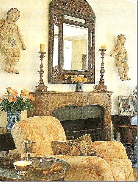
A French fireplace mantel replaces the former wooden one. The putti now flank the mirror. Two wonderful chairs with great arms are upholstered in a Beaumont and Fletcher fabric in peach. An antique Oushak replaces the seagrass.
Another view of the fireplace with the new mantel.
Just beautiful! I love the new decor!
The blue and white lamps with black shades have been replaced with gilt Italian styled lamps with rawhide shades. The pillow is stunning!
The dining room restyled for the new decor – lighter with the white and red striped fabric.
And restyled yet again – French chairs from the breakfast room paired with a French quilt.
The sitting room got new water hyacinth furniture covered in persimmon. I recognize that middle pillow from the living room almost 20 years ago~ I love that!!! The transferware is now almost completely gone, save a few platters. New herbiers flank the breakfast table.
The Hitckcock chairs have been replaced with French chairs, upholstered in Bennison red and cream toile fabric.
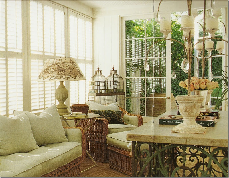
A rare glimpse of the small sitting room off the living room – all white! This furniture was once in the sitting room. I love that lampshade!!!!! The birdcage has moved from the bedroom to here.
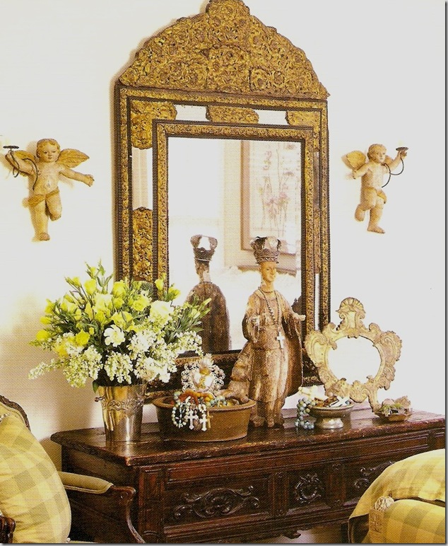
The console with the gilt mirror that was once above the bedroom’s fireplace. Glasser says she has never gotten rid of an antique that she has bought, and I believe her! She moves them from room to room, which is such a wonderful thing about antiques – they look good anywhere.
The bedroom as it was before the house sold. Basically the same, just the mantelscape has changed.
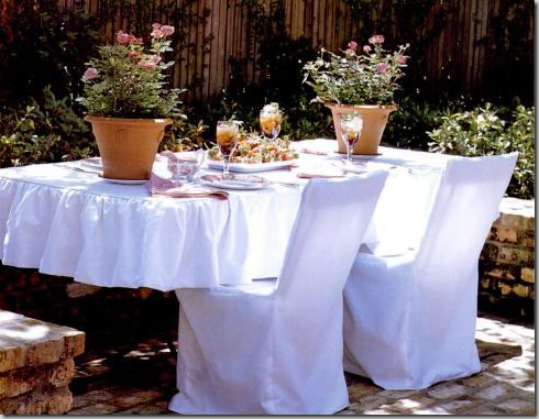
For a book her friend, English designer Katrin Cargill wrote, Fabrications, slipcovers were made for the furniture outside. Just charming!
And here, in blue and white.
Around a built in seating ledge, the table was decorated in white slipcovers for Katrin Cargill’s book, Fabrications.
AND NOW FOR SOMETHING COMPLETELY DIFFERENT: The woman who bought The Perfect House, lived there a few years and put it on the market! These pictures from HAR.com give you a glimpse of the Perfect House as it is today. Somewhere along the way, I have unfortunately lost the listing pictures for when the Glassers had the house for sale to compare.
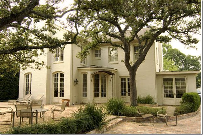
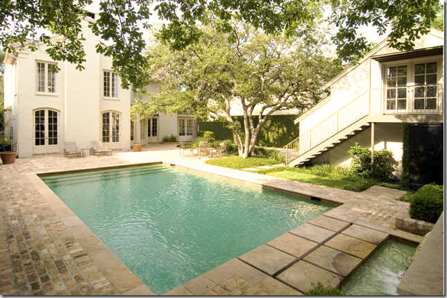
The Perfect House: the living room is on the left, the dining room/library is the right window. I’m not sure how much this has changed. I think the two trees were planted after the Glassers left. And the house may have been painted another color.
The back yard: the backdoor foyer which Glasser had decorated with the tall clock is located in the center. The family room is to the left with the master bedroom above it. This was a new addition that the Glasser added when they moved in. The living room is the French door next to the backdoor foyer. The white sitting room is at the far right.
The backyard swimming pool. The sitting room looks out over the pool. The garage has been turned into a guest house upstairs. The main house has only two bedrooms.
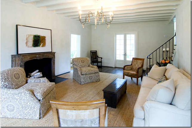
The new living room! How different can it be? The chairs actually look like the same style – I wonder if they were just recovered? Everything looks so stark and white compared to when Glasser lived here, yet it is still very beautiful, as is!
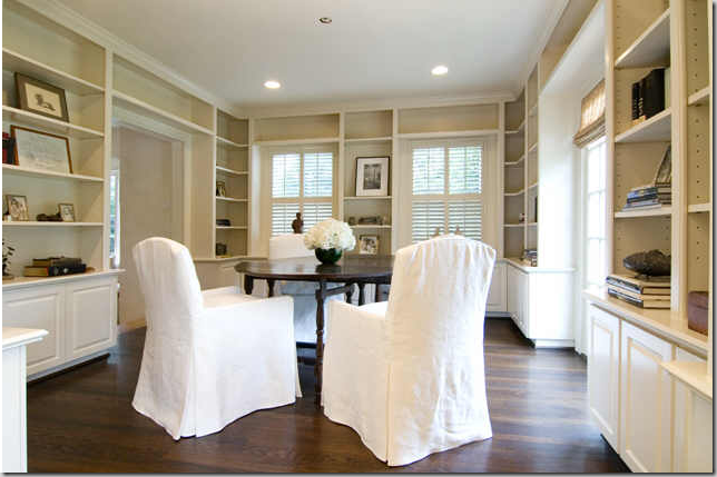
The dining room/library. The door to the left leads to the kitchen. It looks so different all white!!!!!
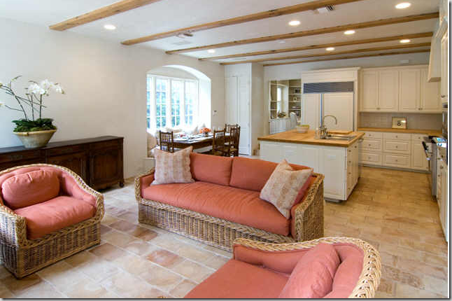
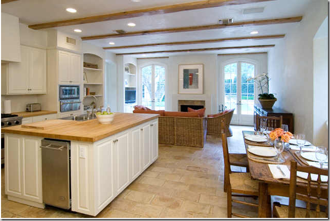
The sitting room/kitchen. You can really see the French pavers here. The furniture looks exactly like what Carol had! Did she sell this set with the house? Or did she stage this for the realtor? This room really looks wonderful! I like how the cabinets are painted now. It all looks so fresh. You can see the dining room through the door next to the refrigerator.
Looking out towards the pool and the back yard. On the left, between the two built in shelves is the back door foyer and the way back into the living room. I wish you could see the range to see if the blue and white tiles were removed. I miss the curtains, among other things.
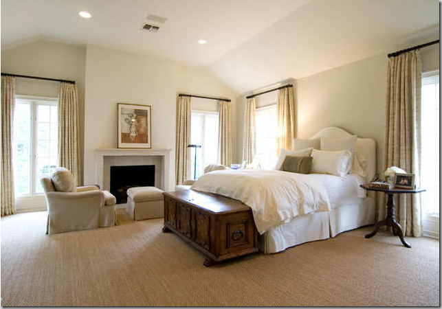
The master bedroom – without all the Bennison. Plus the fireplace mantel has changed. This is so pretty and soothing, but I do miss the Bennison! I told you it was completely different!
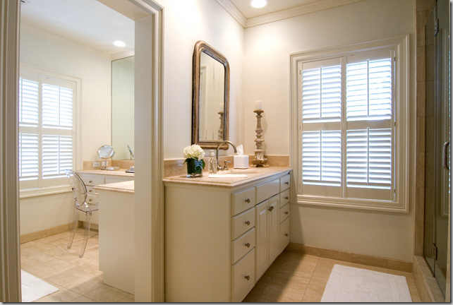
The master bathroom and vanity area.
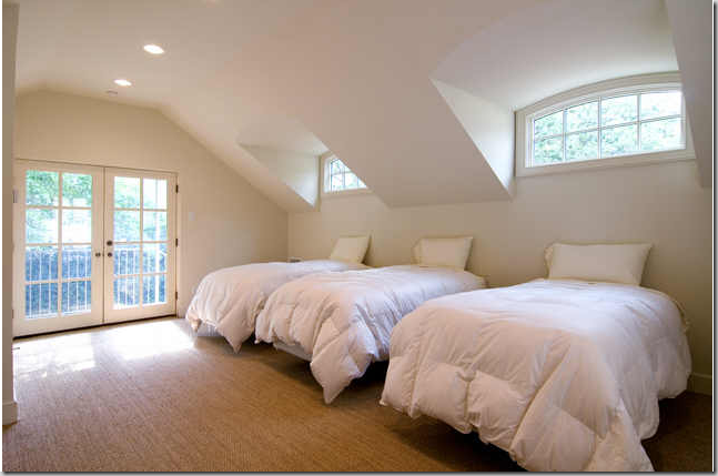
Above the garage, the guest quarters – set up as a bunk room. This would be a perfect room for a teenager, or a college age child – or an office.
GLIMPSES OF THE FUTURE????
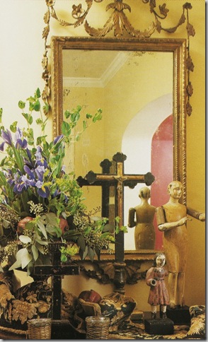
In an interview with Carol Glasser in Antique Shops and Designers, these pictures were included. Are they from her new house? I don’t know, but they could be! I can’t wait for the new house to be published! I hope it will be. These pictures look so interesting.
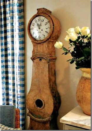
A Swedish Moro clock. The roses certainly look like Glasser’s style!
I hope you have enjoyed reading about Carol Glasser and seeing how she has influenced my own design style through the years. To read more about this talented designer and her fabulous style, see these books:
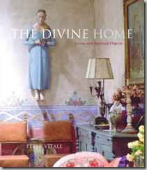
Peter Vitale’s, The Divine Home, has pictures of The Perfect House, available here.
Mary Emmerling’s Romantic Country has a story about Glasser’s former house, too. Available here.











No comments:
Post a Comment